Branding & Rebranding
for Global Trade and International Logistics

We build strong, memorable brands designed for the future of global trade.

Transform My Brand

What We Do

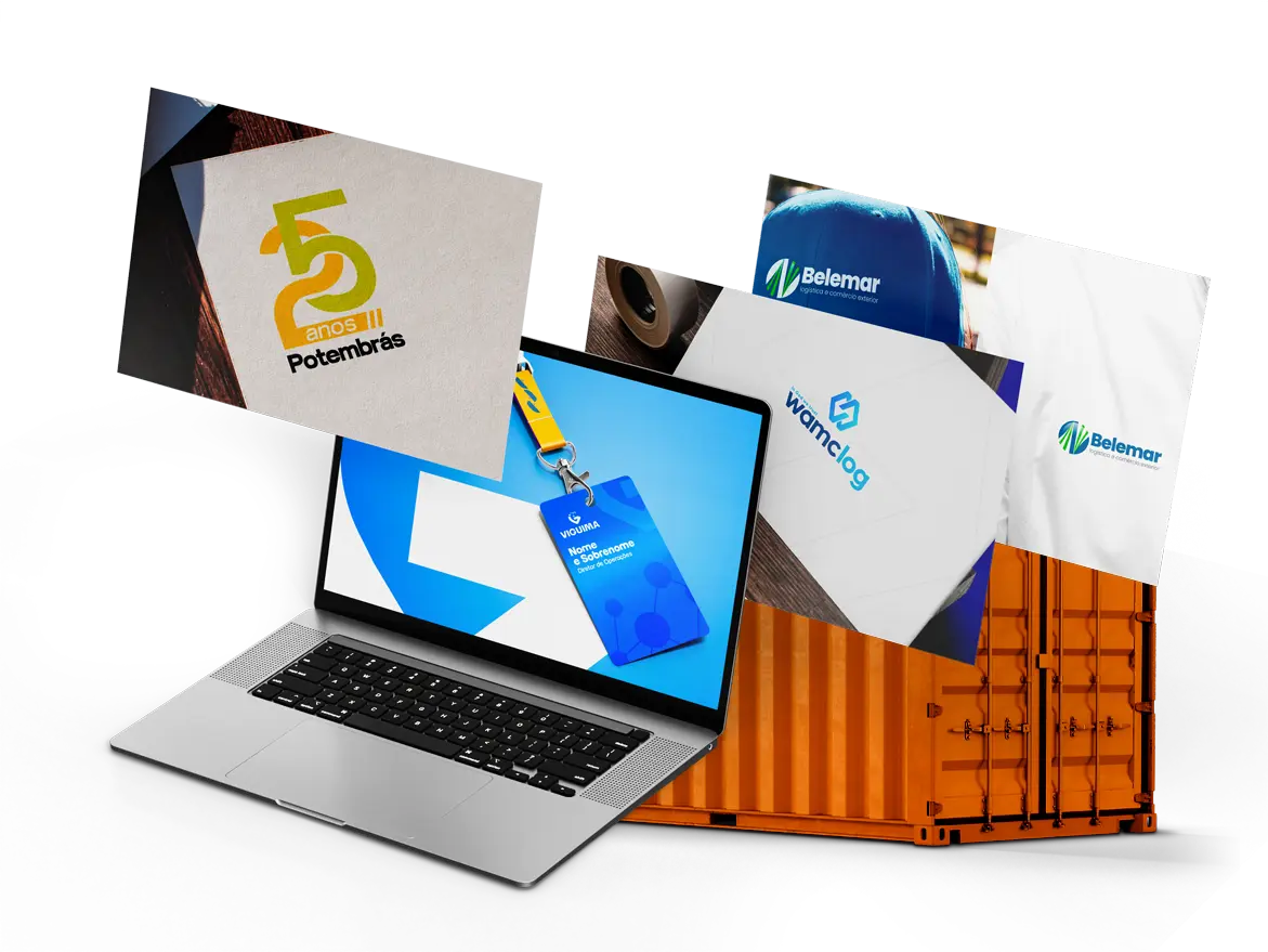
At Comexland, we create and reposition brands for companies operating across international trade, logistics, freight forwarding and technology.

By combining strategy, design and business insight, we develop brands that strengthen authority, improve market positioning and create meaningful differentiation in an increasingly competitive industry.
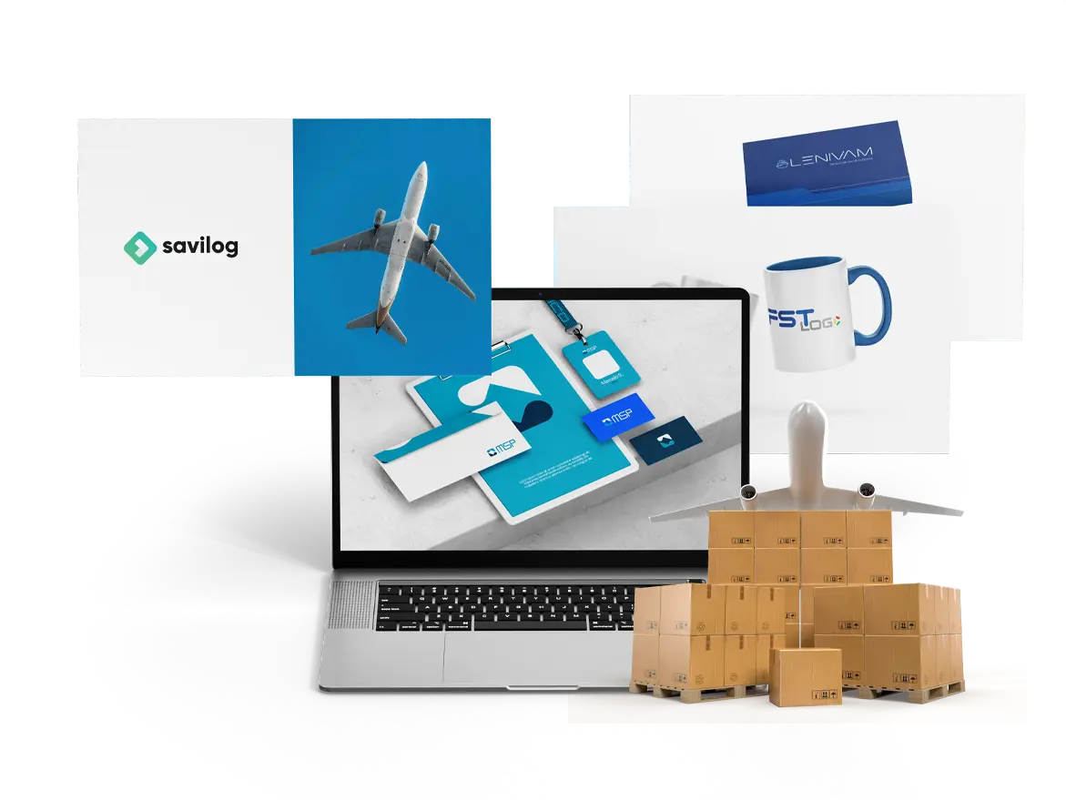
Our Branding & Rebranding Projects

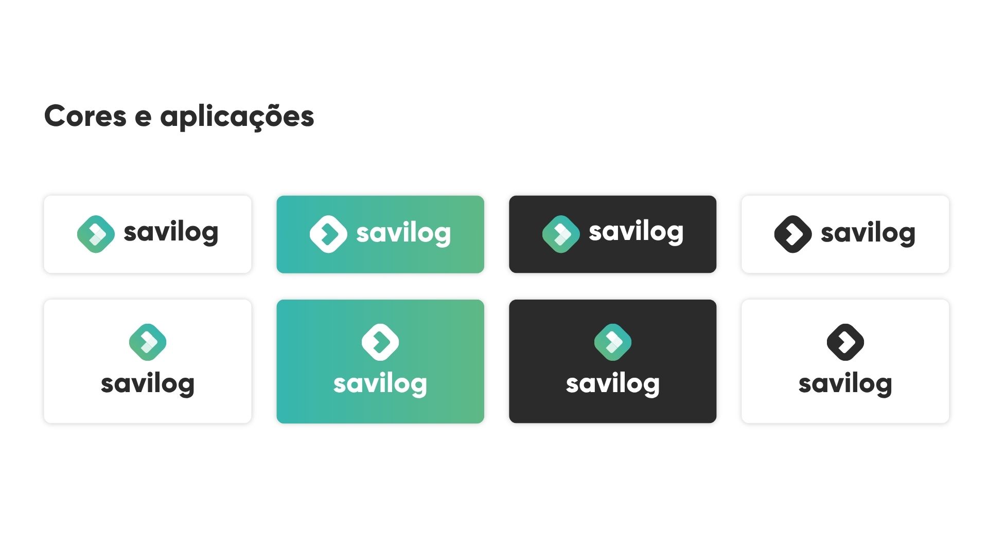
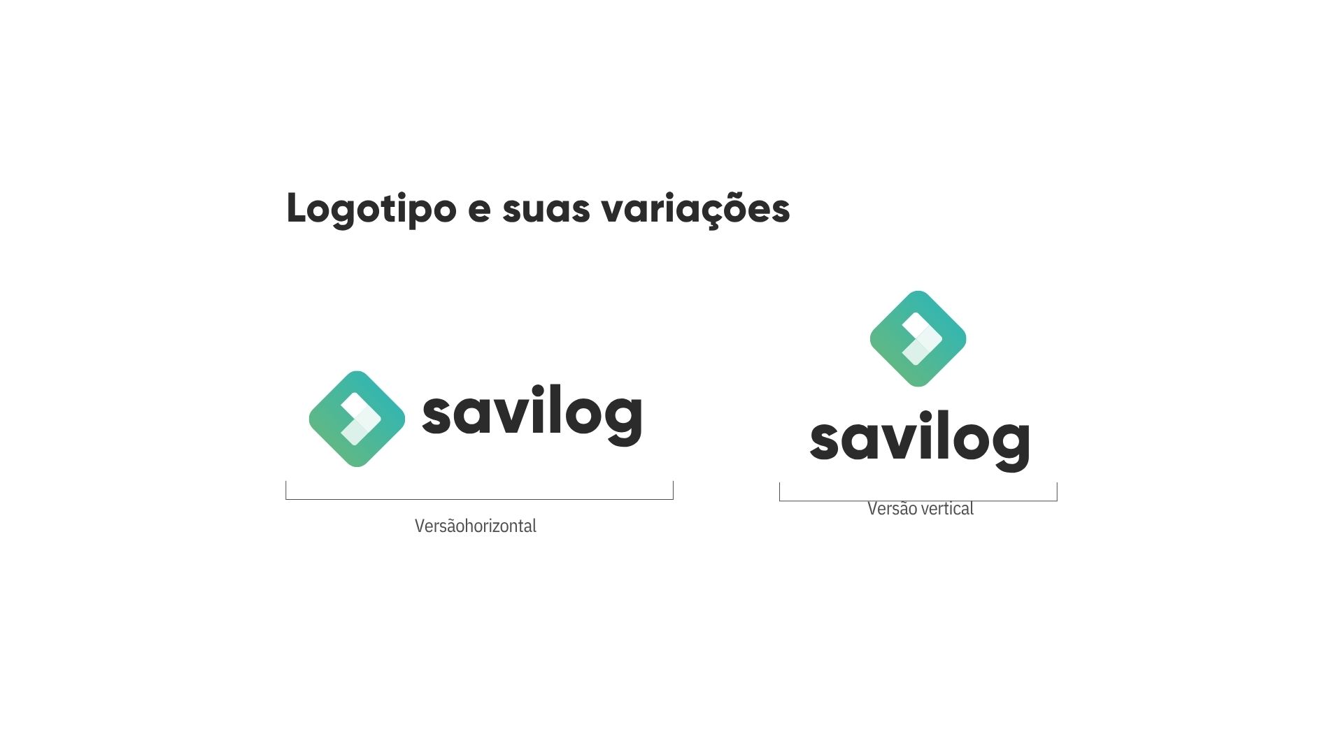
SAVILOG

The NVOCC with a Brazilian Soul

When Savilog partnered with Comexland, the goal was to develop a brand capable of communicating global strength while preserving its Brazilian identity.

We created a visual identity that combines movement, modernity and international presence, culminating in the concept that became the company’s signature:

“A NVOCC with a Brazilian Soul”

The new identity repositioned Savilog with greater clarity, energy and a distinctive personality within the global logistics market.

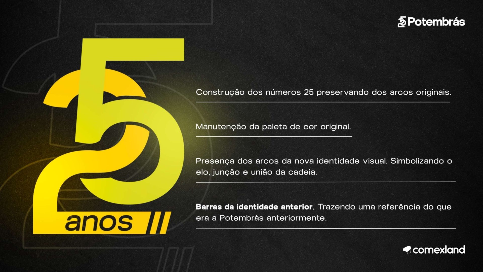
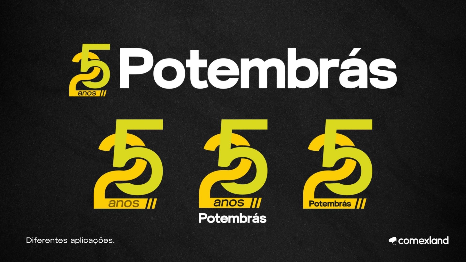
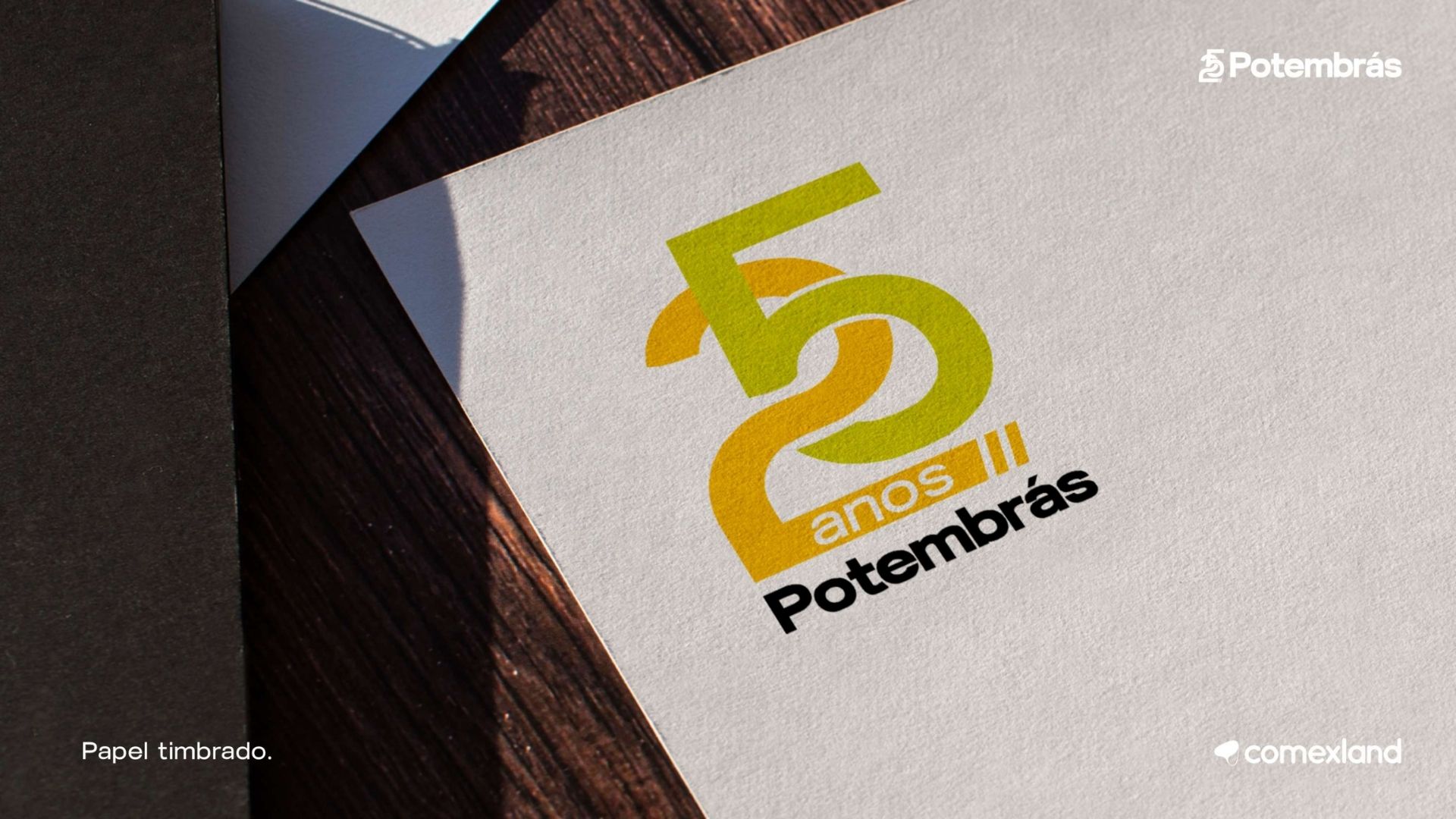
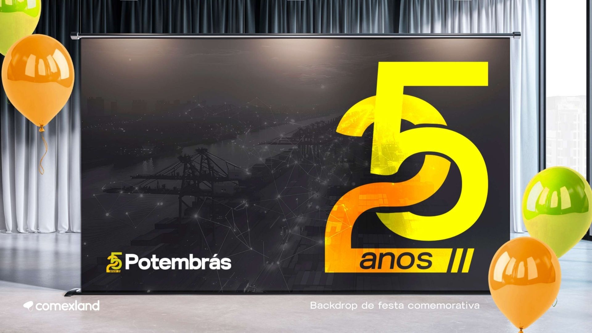
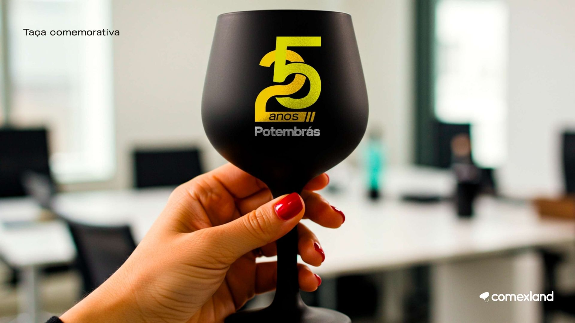
POTEMBRÁS

Potembrás is a well-established company, and the challenge was to modernize its brand without compromising the credibility built over more than 25 years.

We developed a visual system based on operational excellence, trust and consistency, reflecting the company’s expertise in customs brokerage and international transportation.

The rebranding included:

  • A refreshed, technology-driven color palette
  • A structured grid system
  • Custom logistics icons representing operational stages
  • A contemporary visual language that reinforces credibility

COMEX SOLIDÁRIO

Comex Solidário was created to represent the social impact generated by the international trade community.

The visual identity needed to communicate empathy, collaboration and purpose while maintaining a professional and recognizable brand image.

Watch the Official Video

VIGUIMA

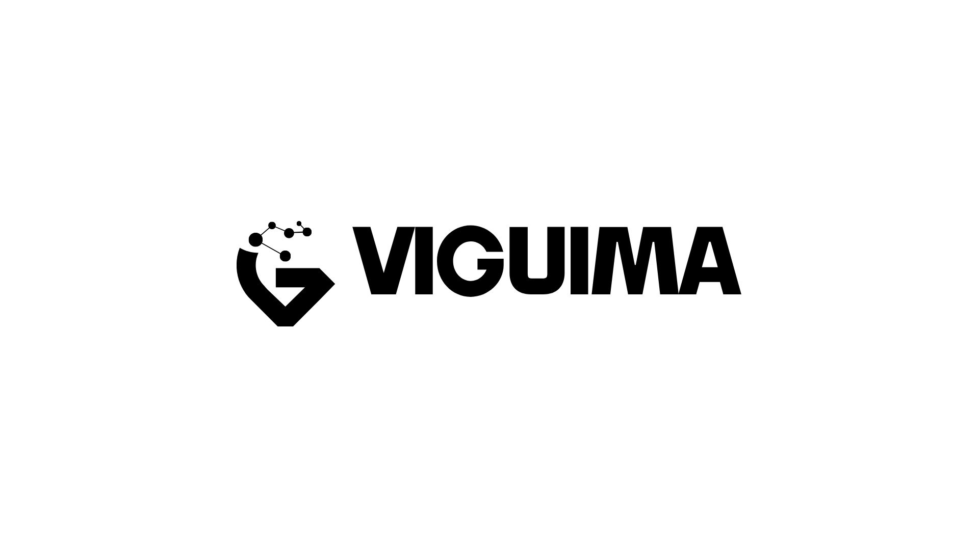
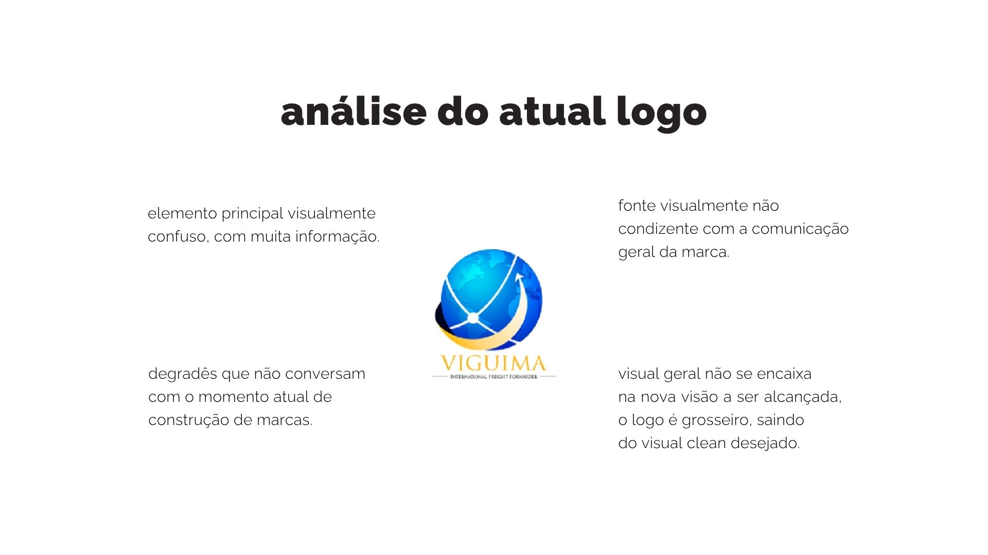
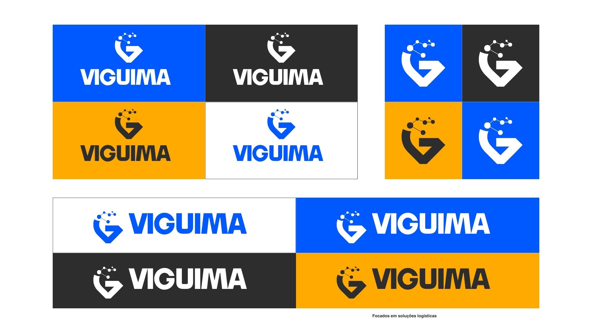
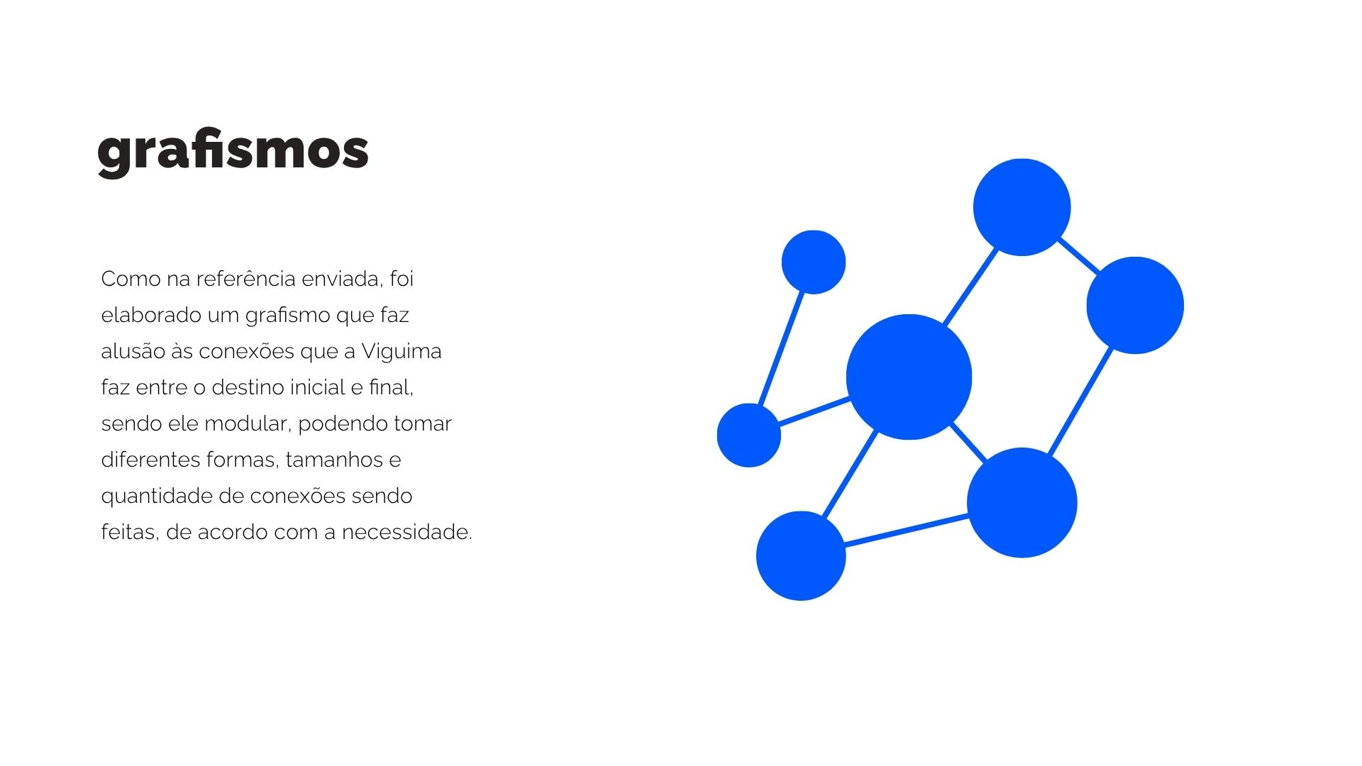
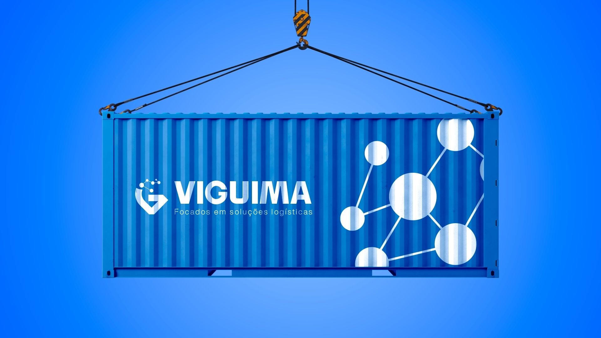
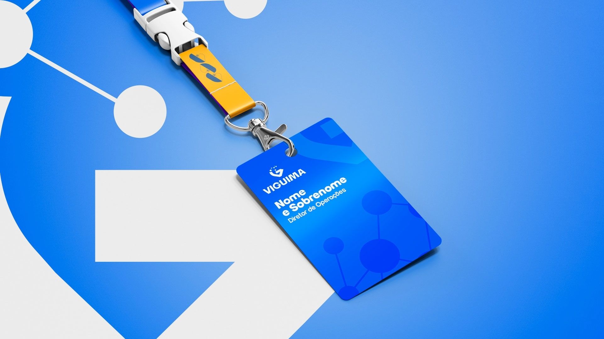
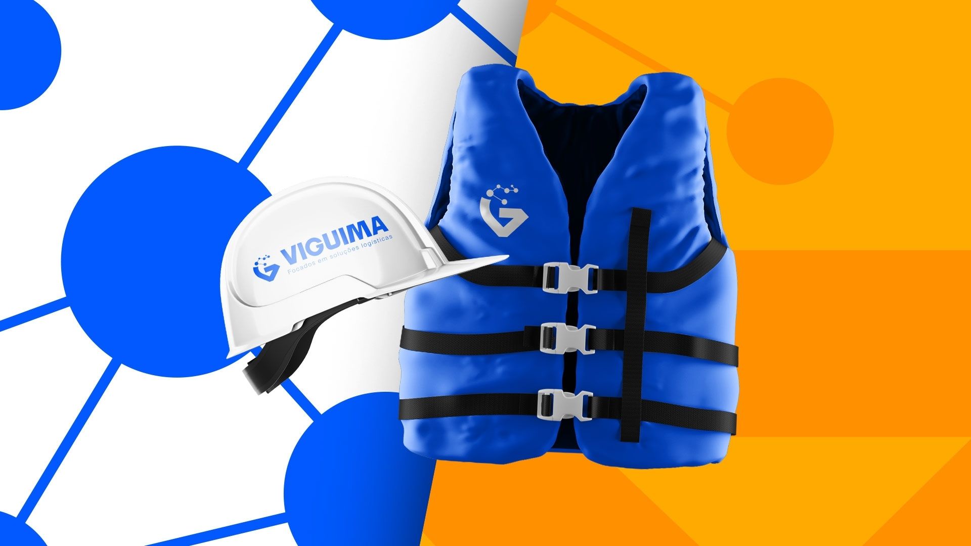
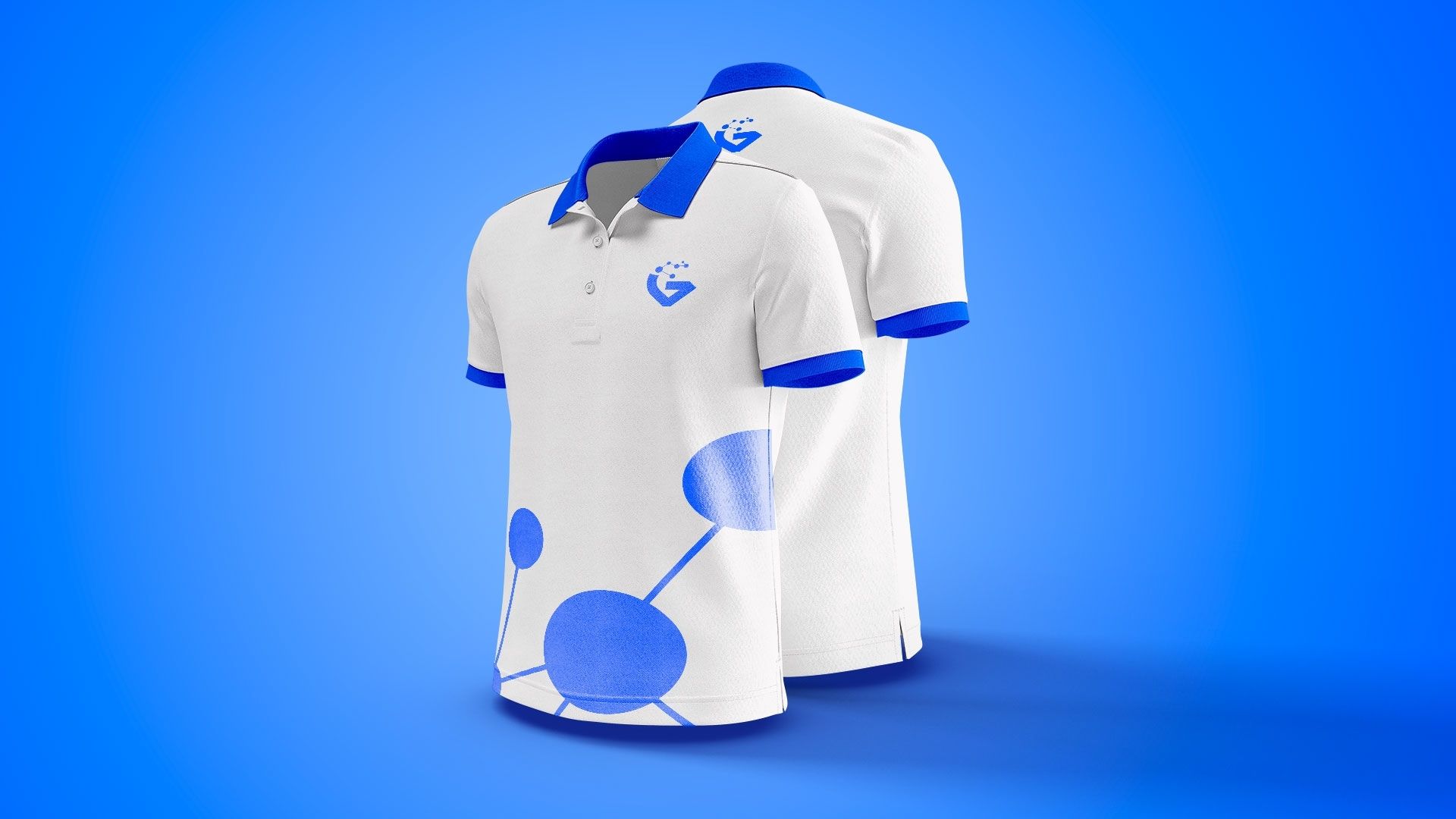
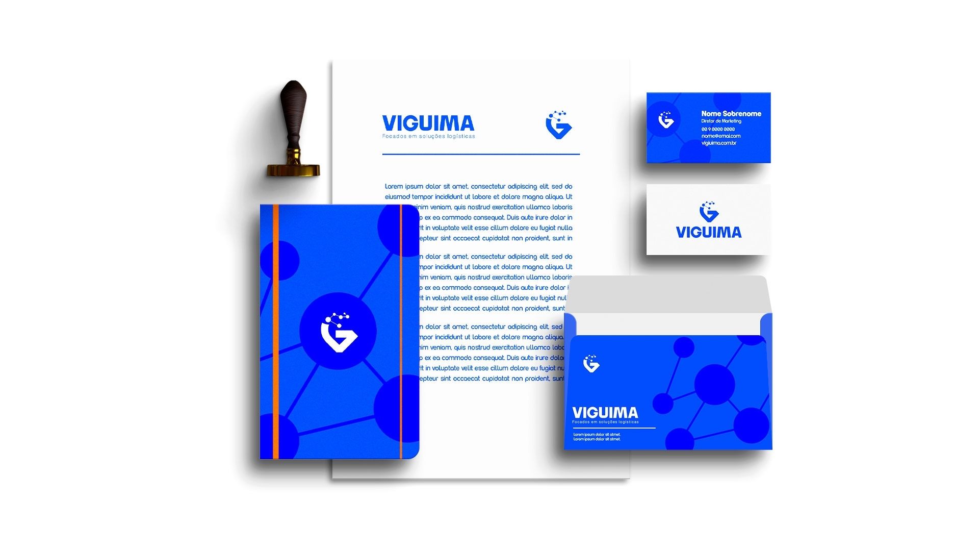
Viguima required a visual identity capable of expressing strength, engineering expertise and precision.

We developed a bold brand with solid geometric forms and a color palette that reinforces efficiency, reliability and technological capability.

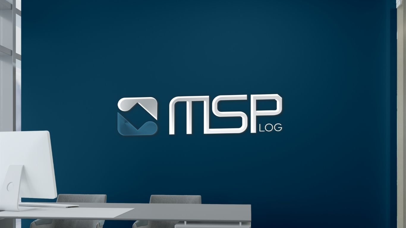
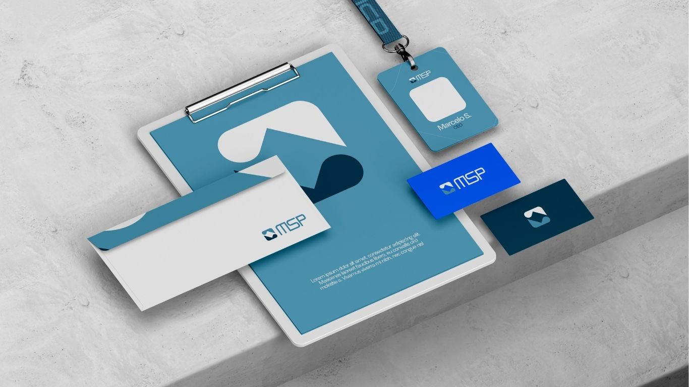
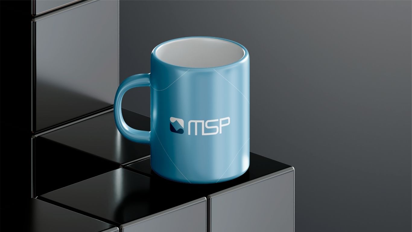
MSP

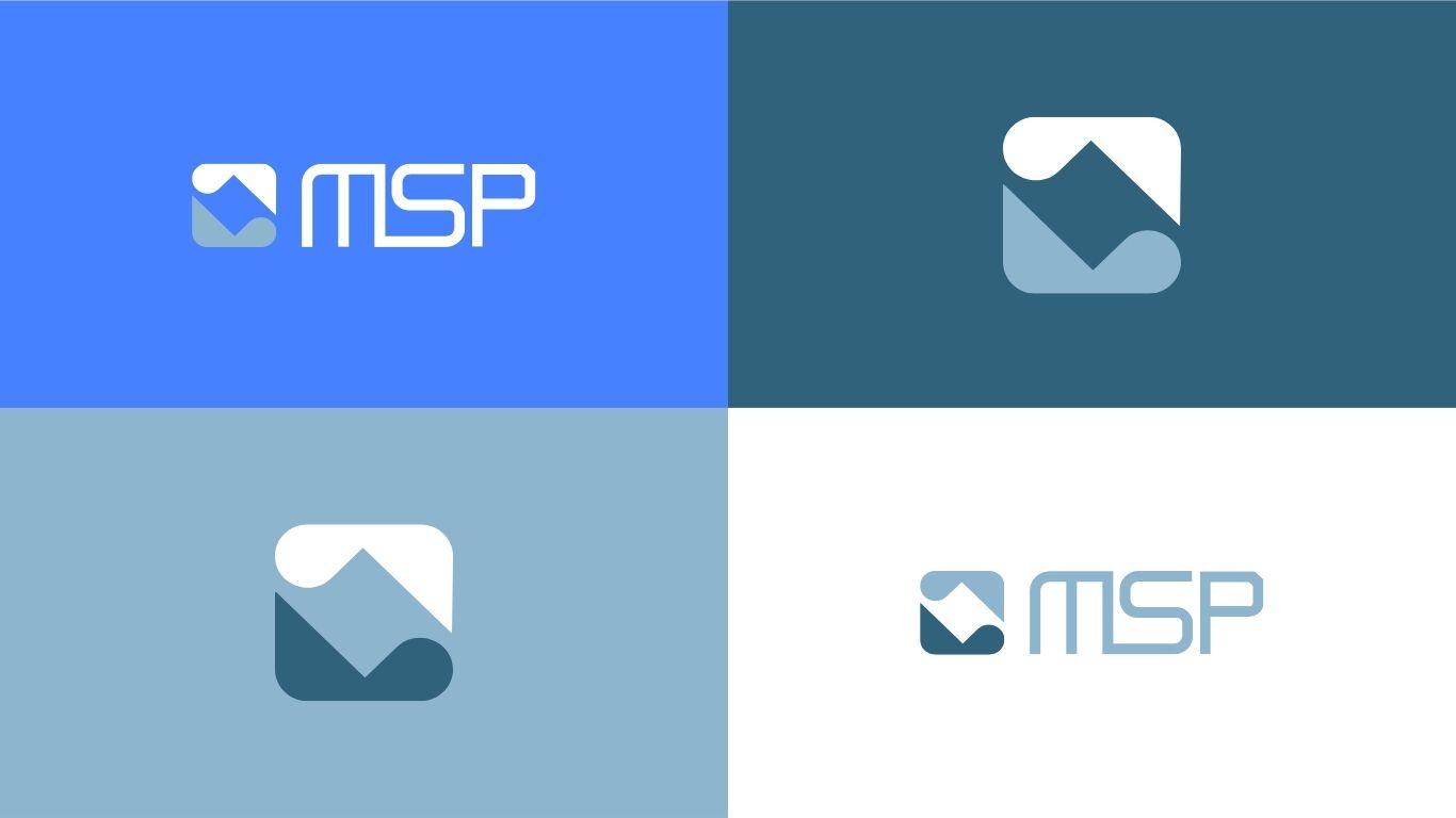
MSP underwent a complete visual refinement process. We reorganized its color palette, redefined typography and created a cleaner, more professional visual language to strengthen communication across every touchpoint.

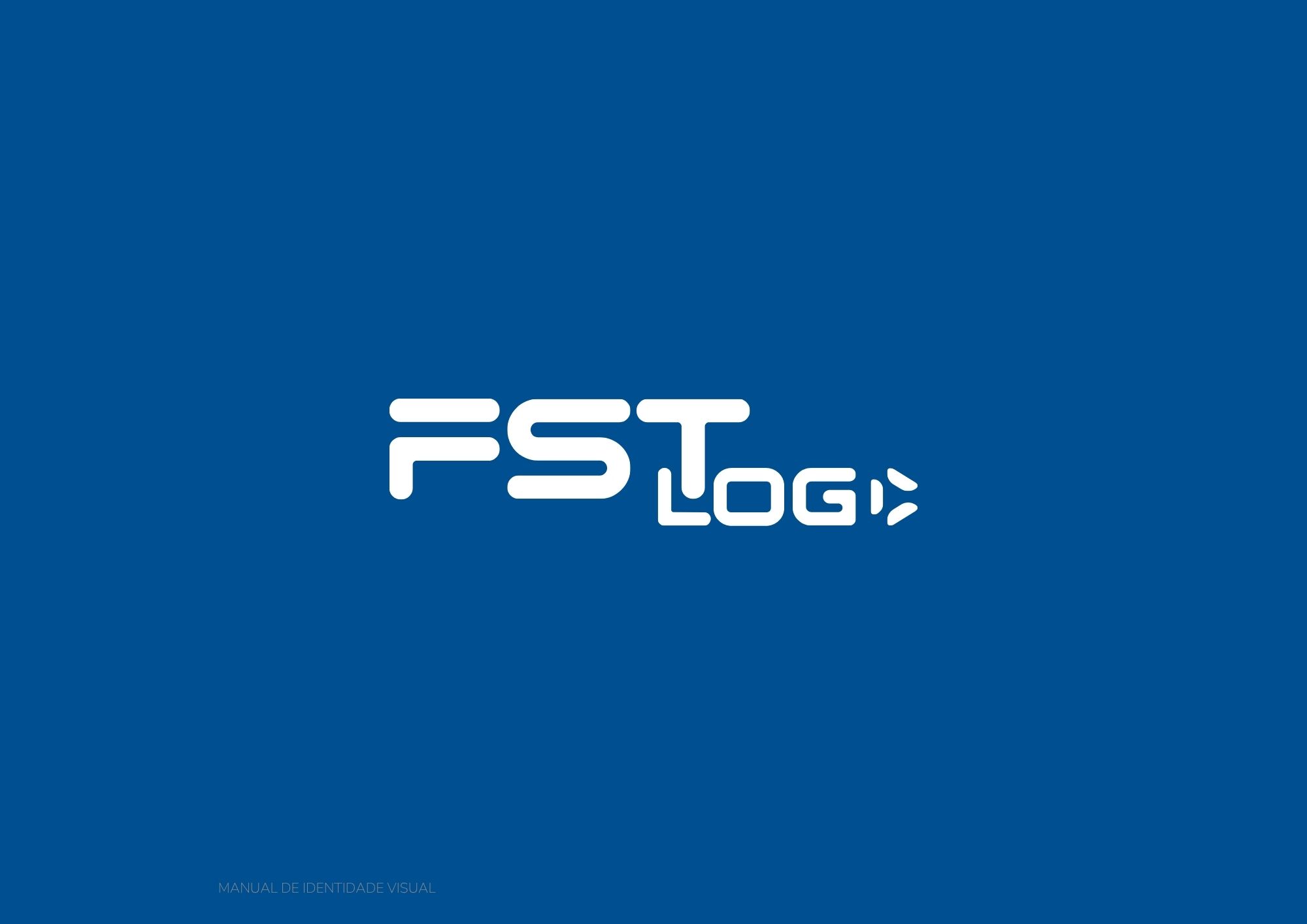
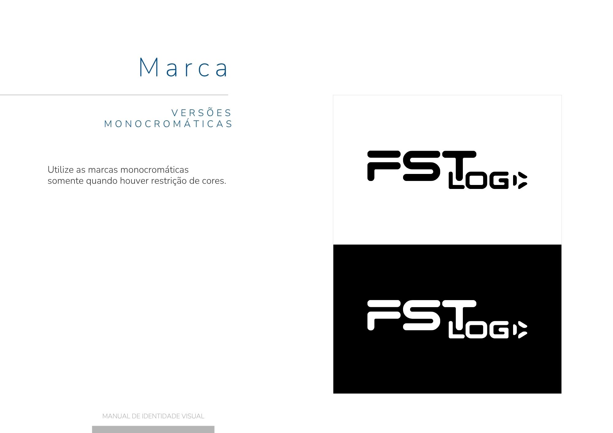
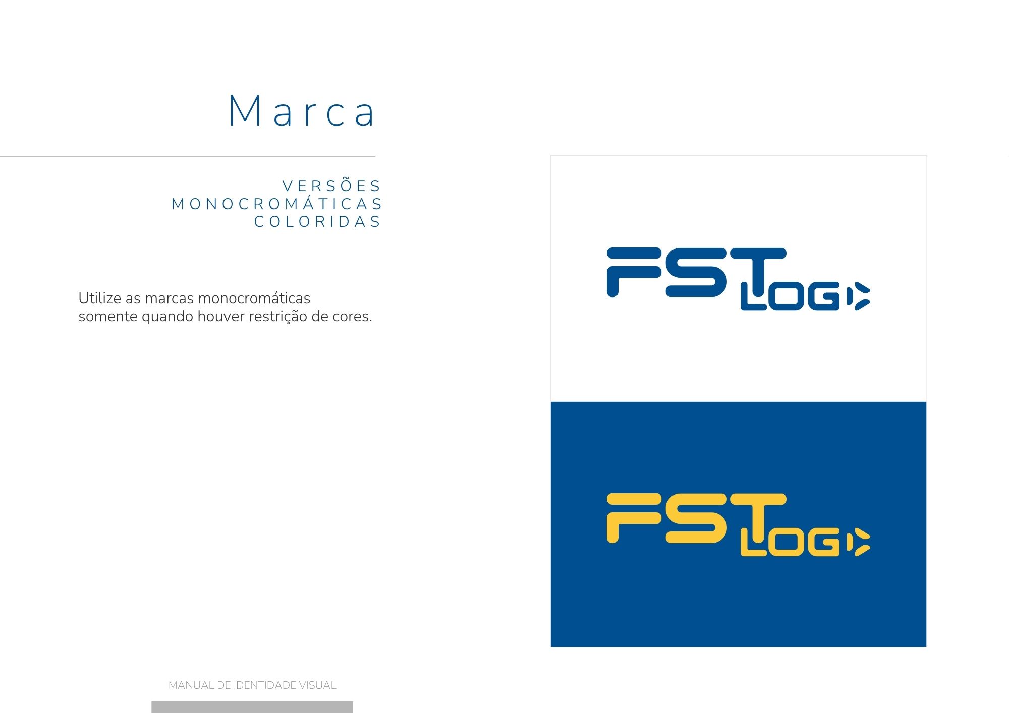
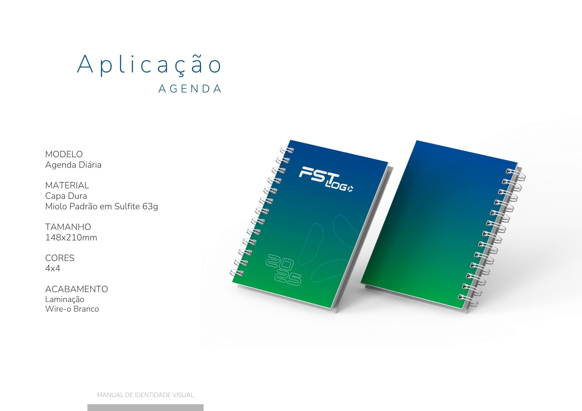
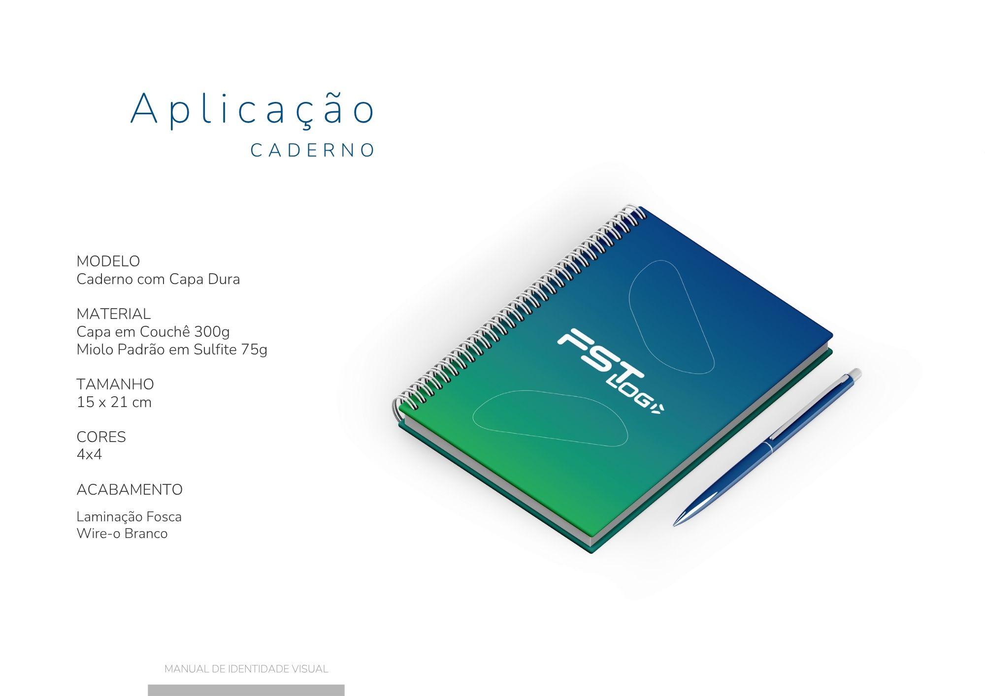
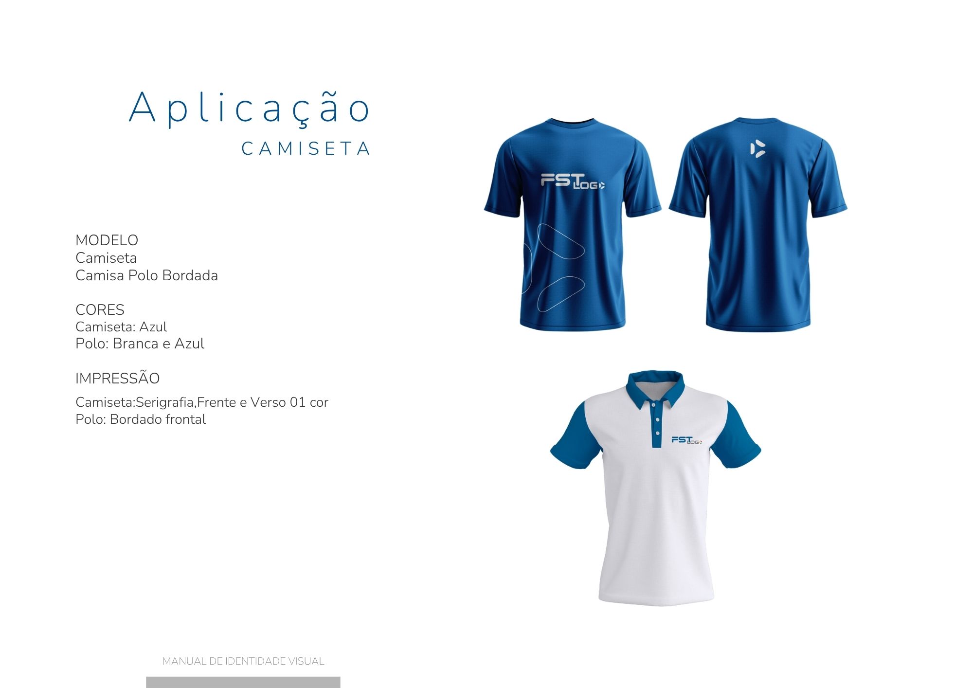
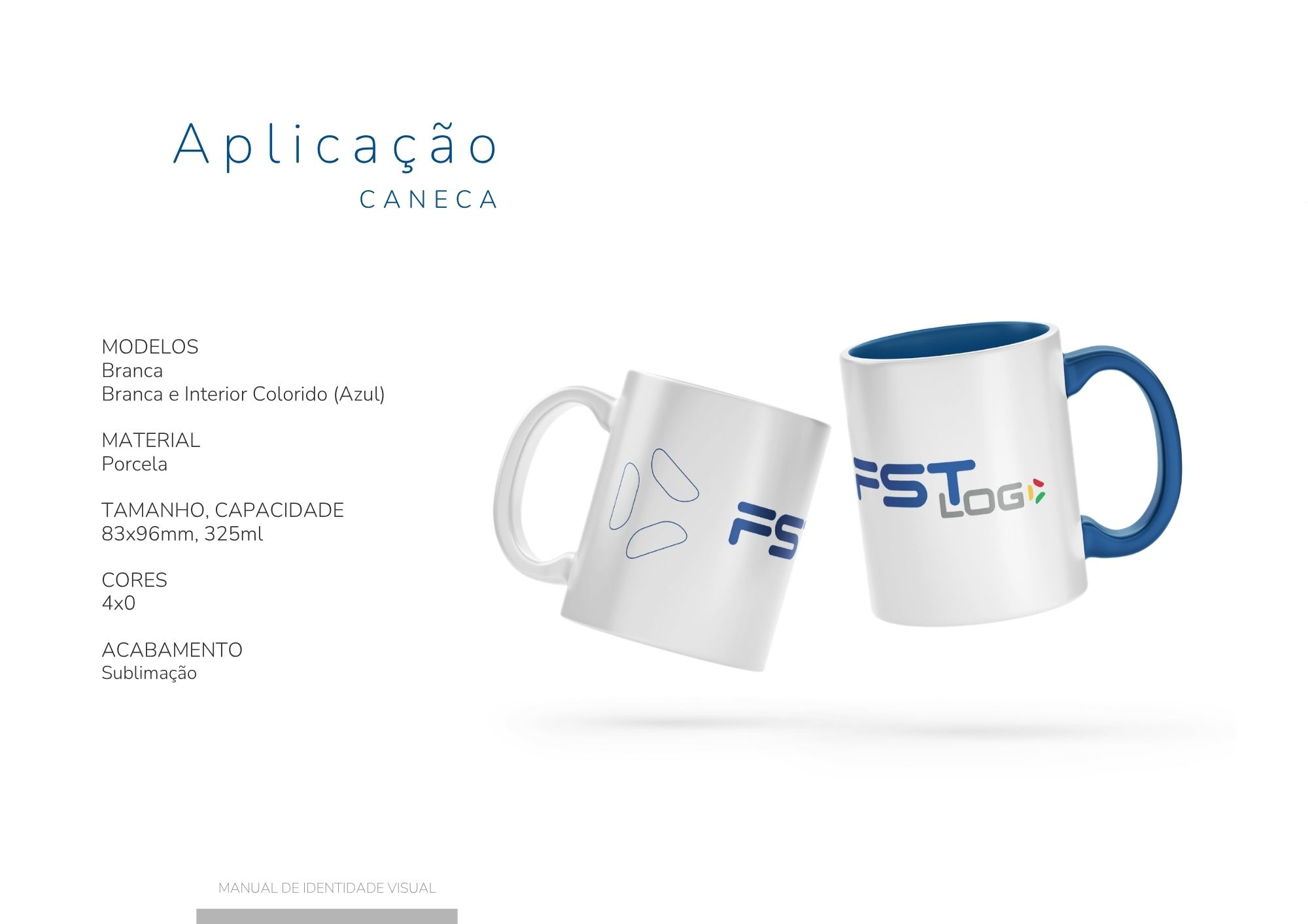
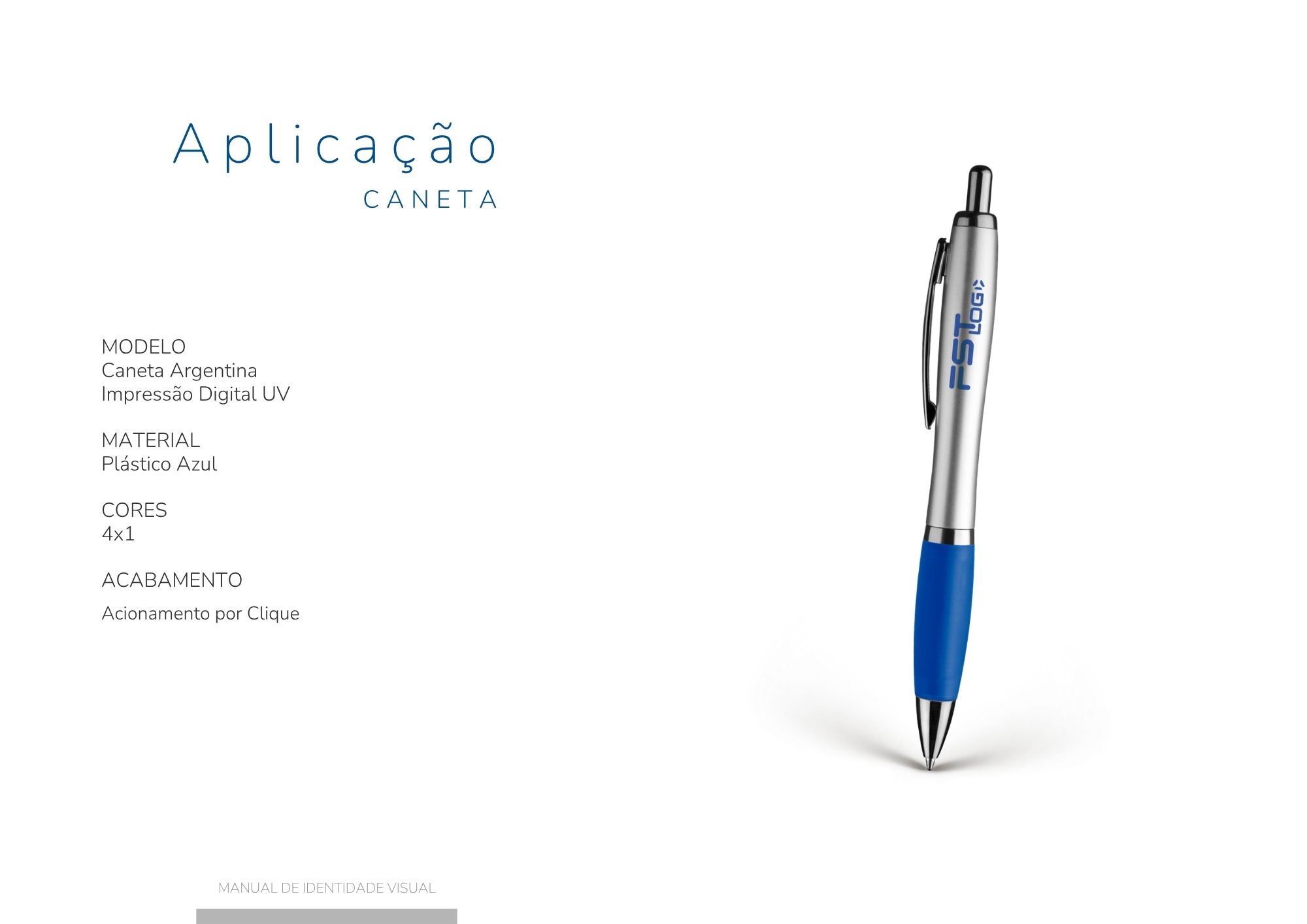
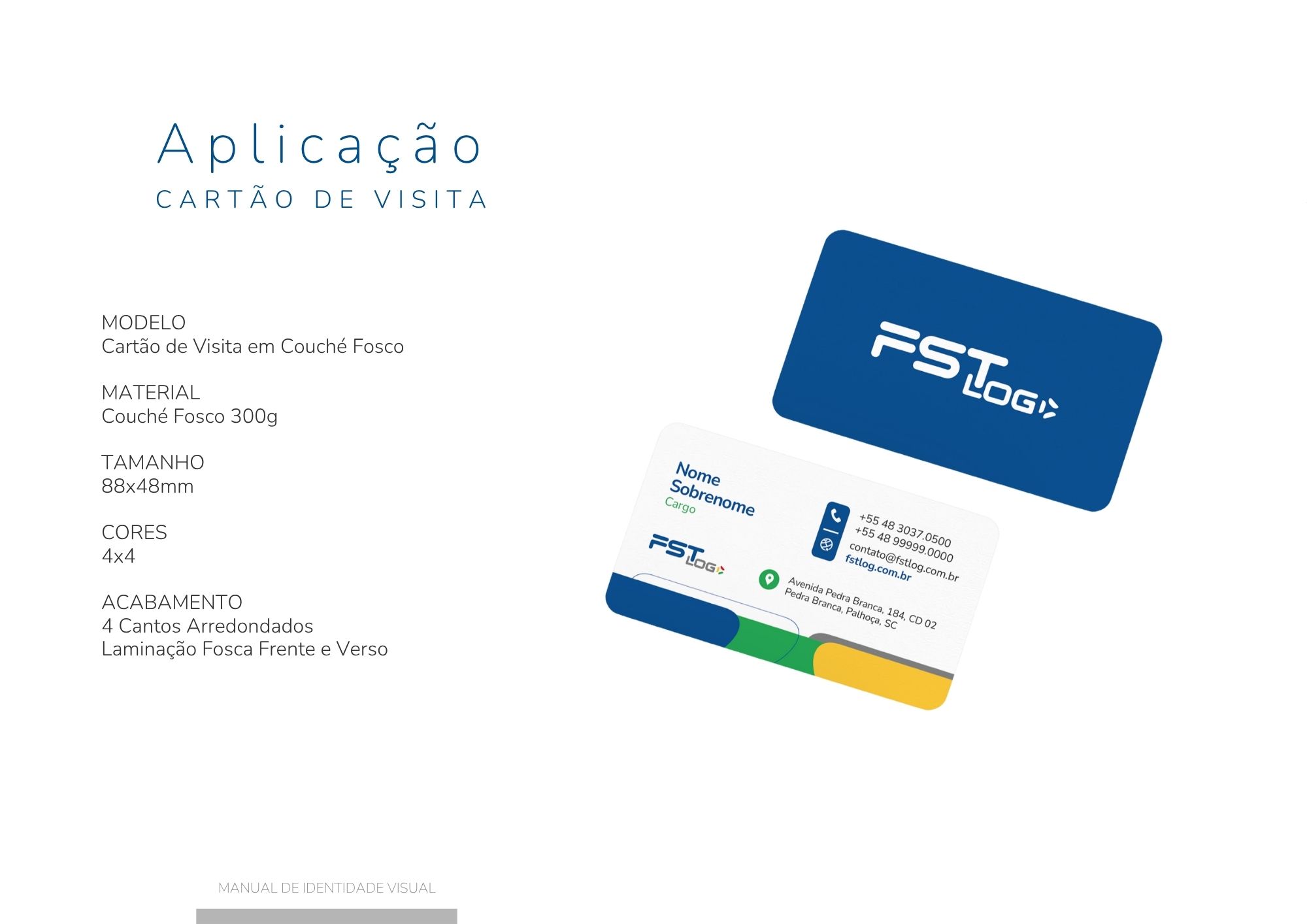
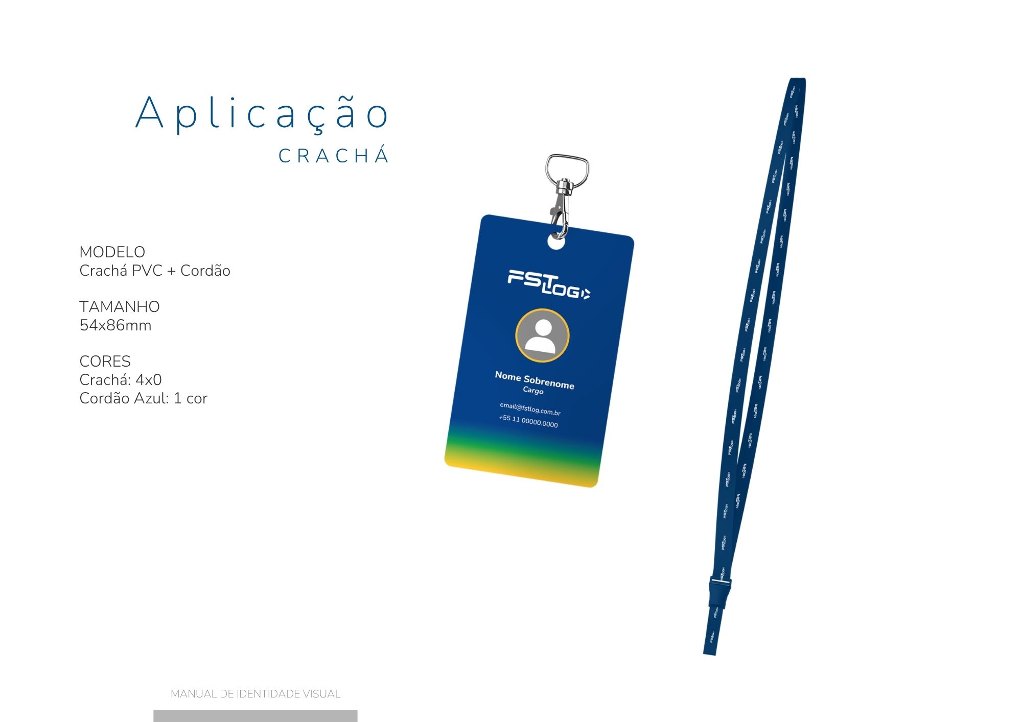
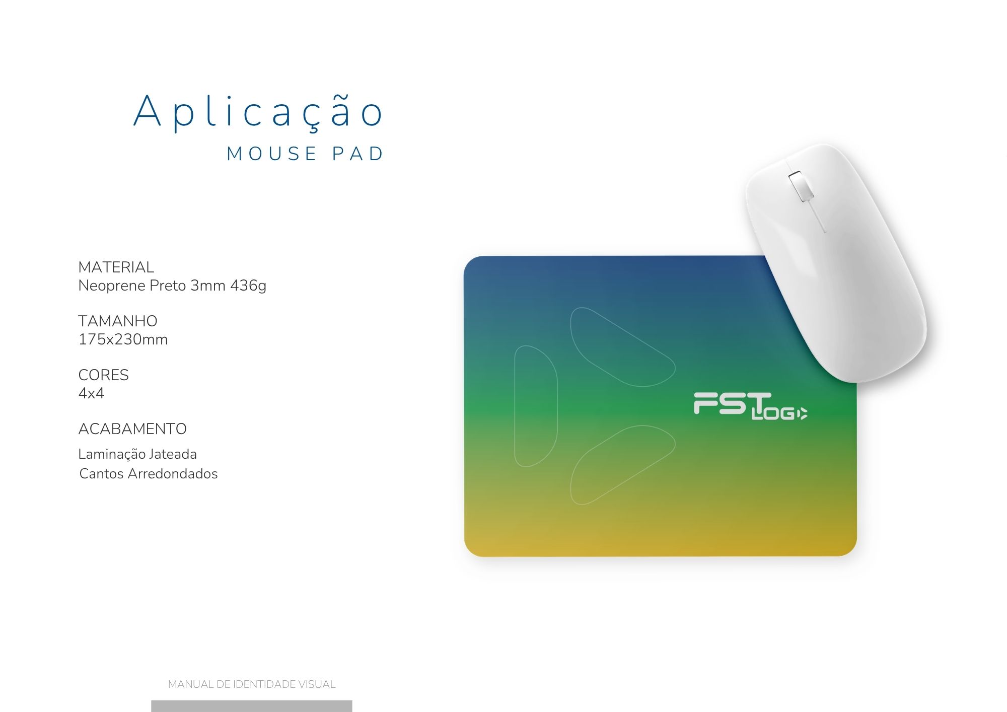
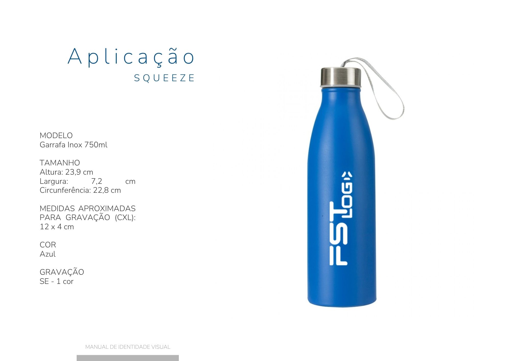
FST LOG

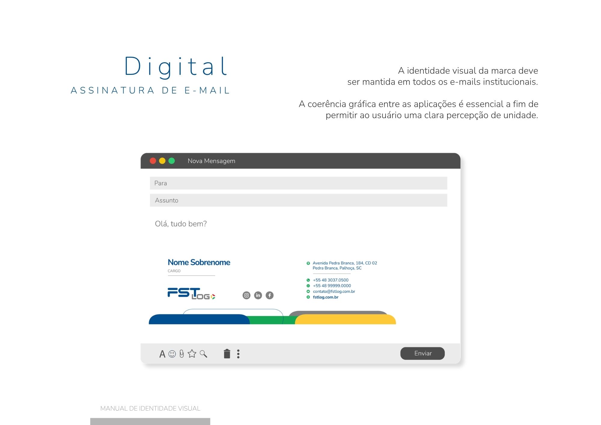
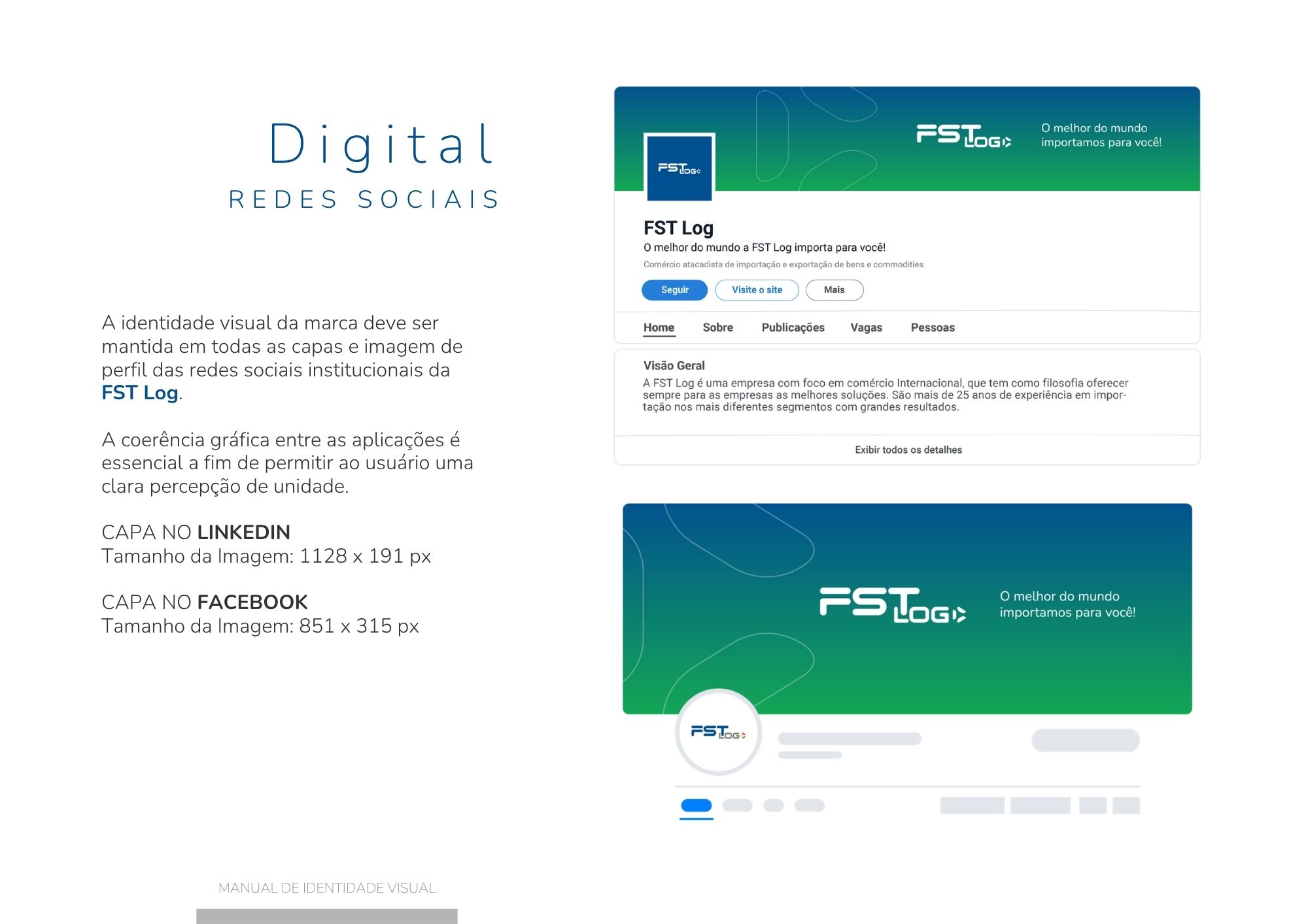
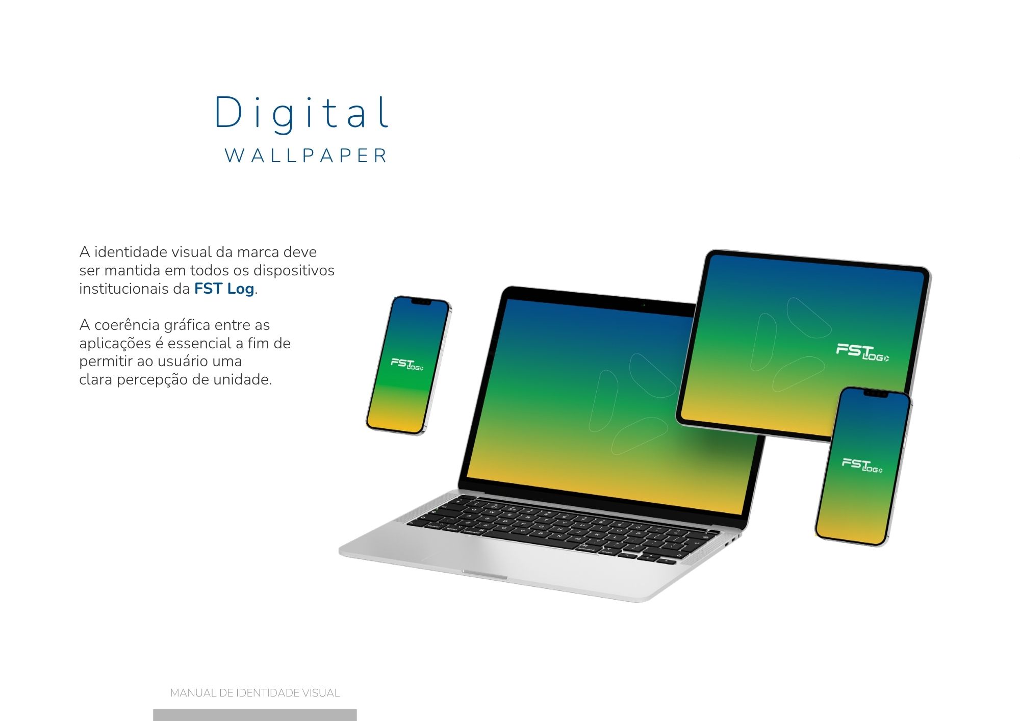
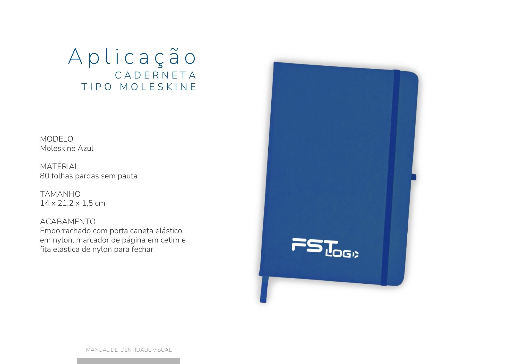
As a growing company in the international trade industry, FST LOG needed a brand that projected professionalism and global ambition.

The rebranding introduced cleaner lines, stronger colors and a consistent visual identity designed to support future growth.

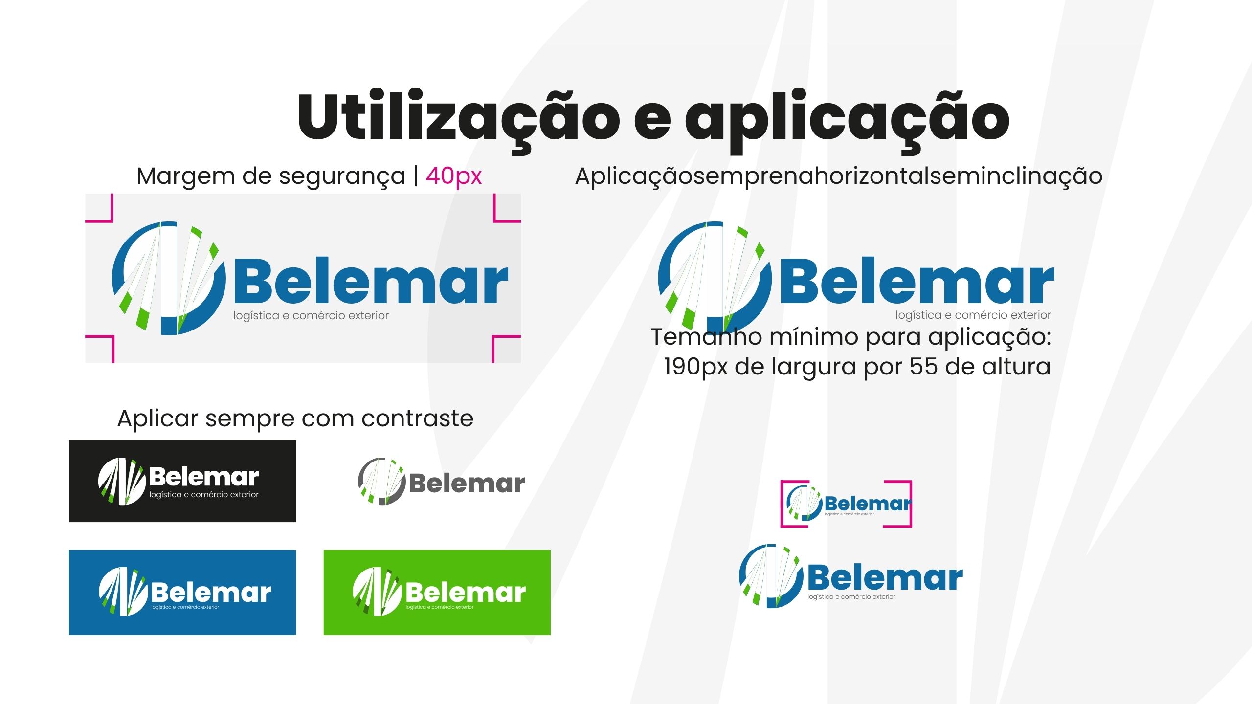
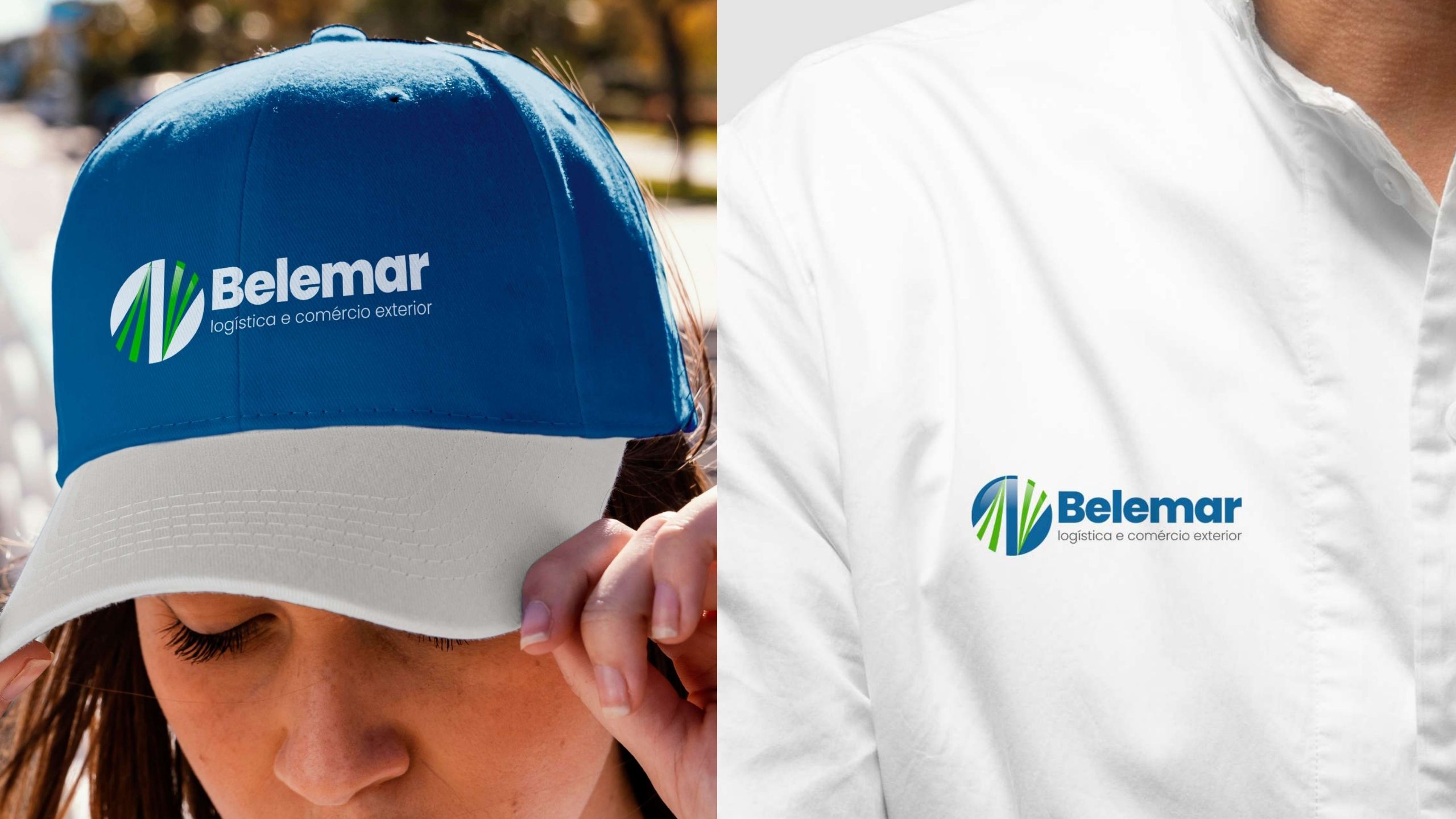
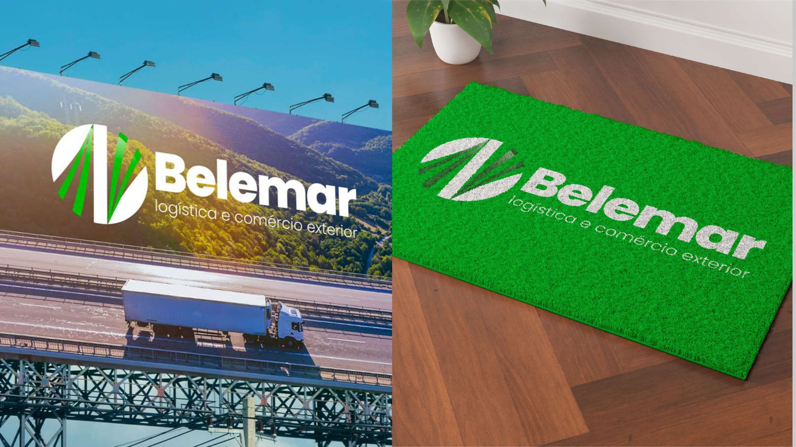
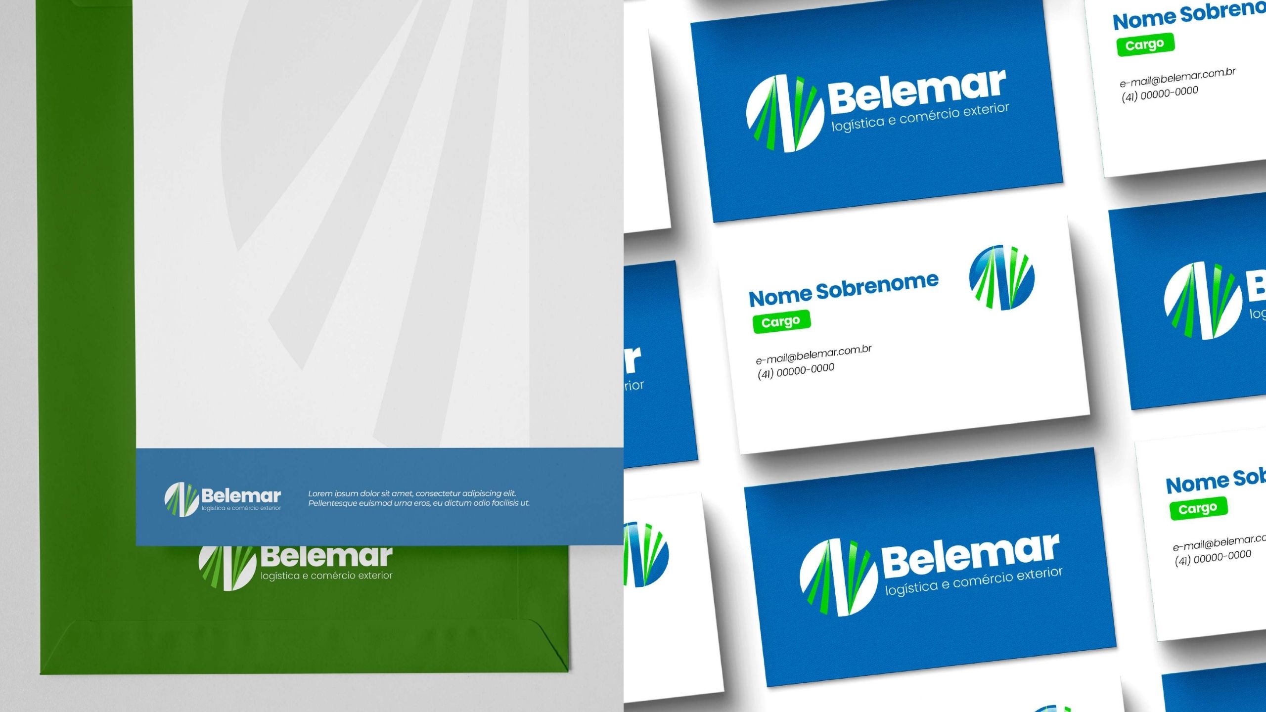
BELEMAR

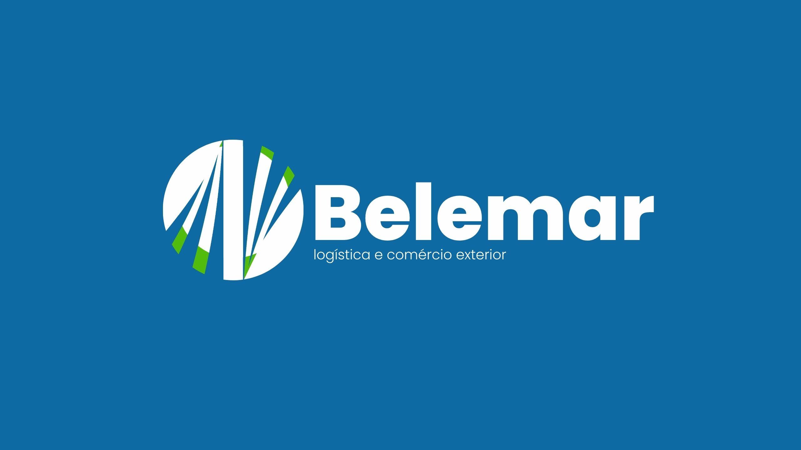
Belemar received a modern visual identity inspired by the maritime industry.
Fluid graphic elements combined with confident typography create a brand that reflects movement, reliability and international logistics.
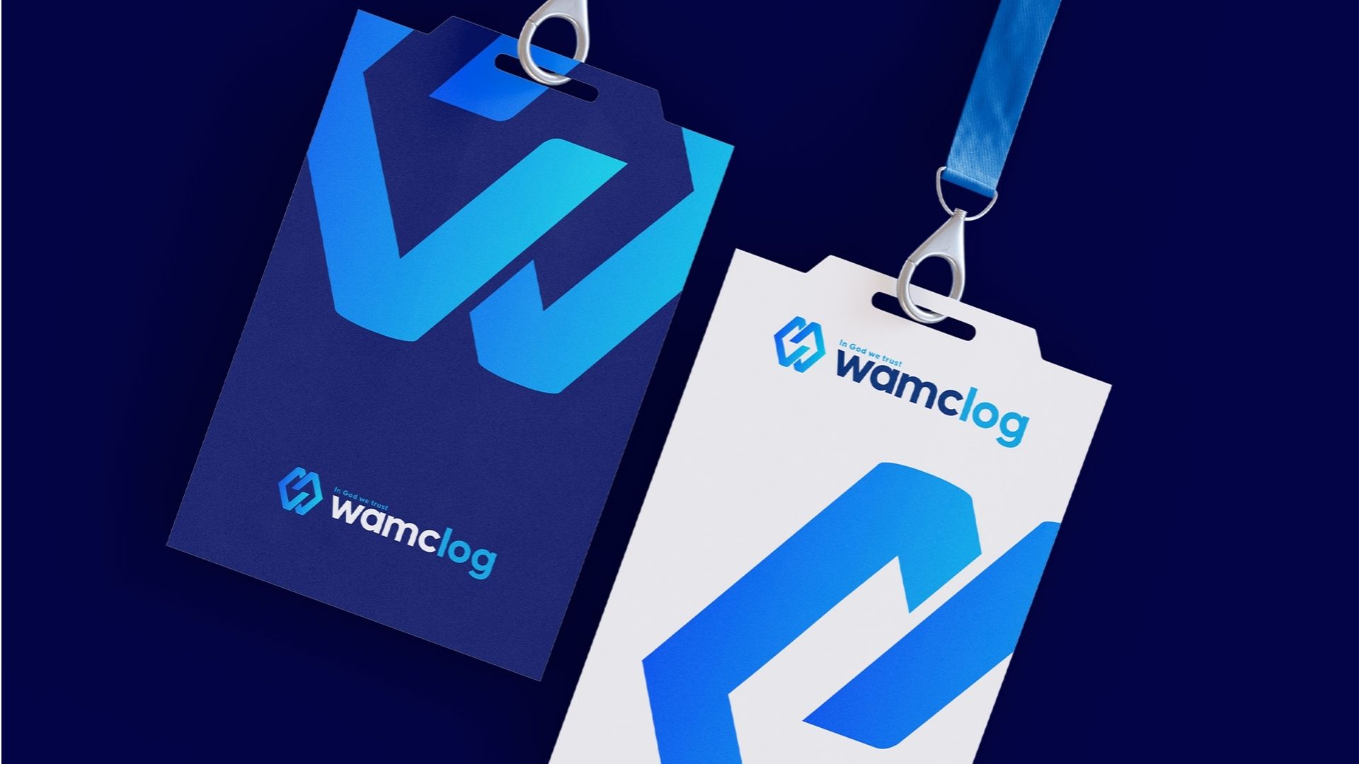
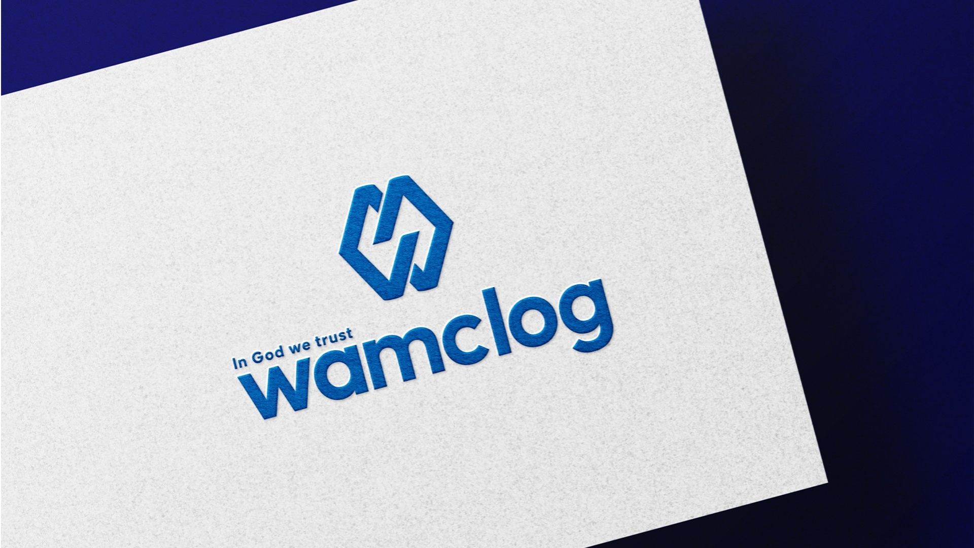
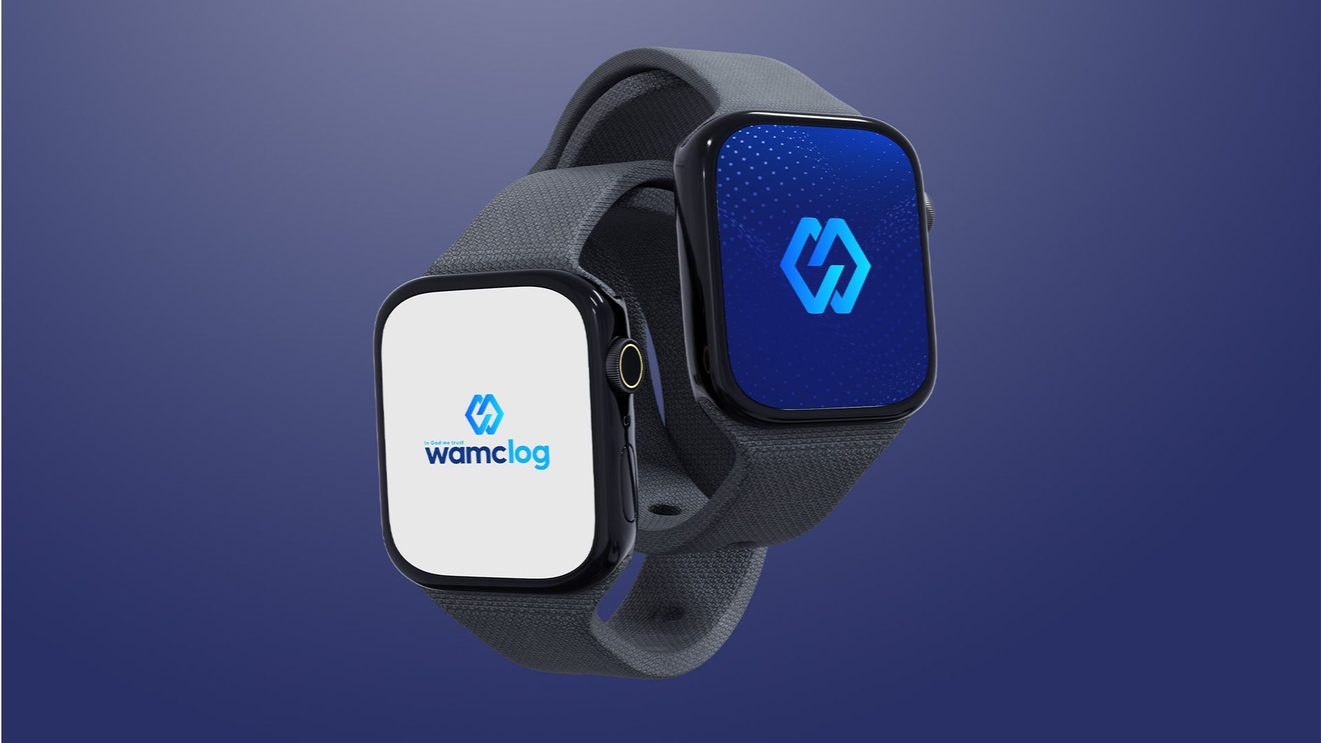
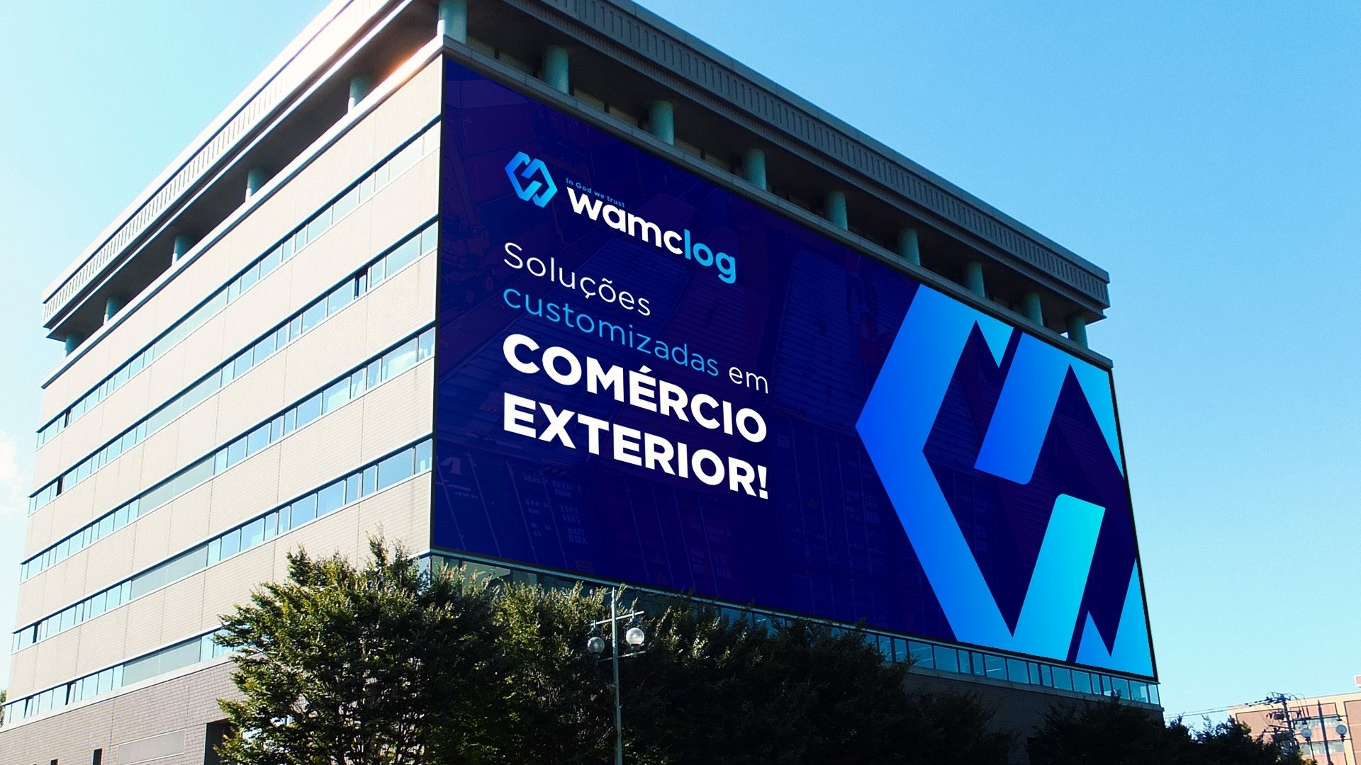
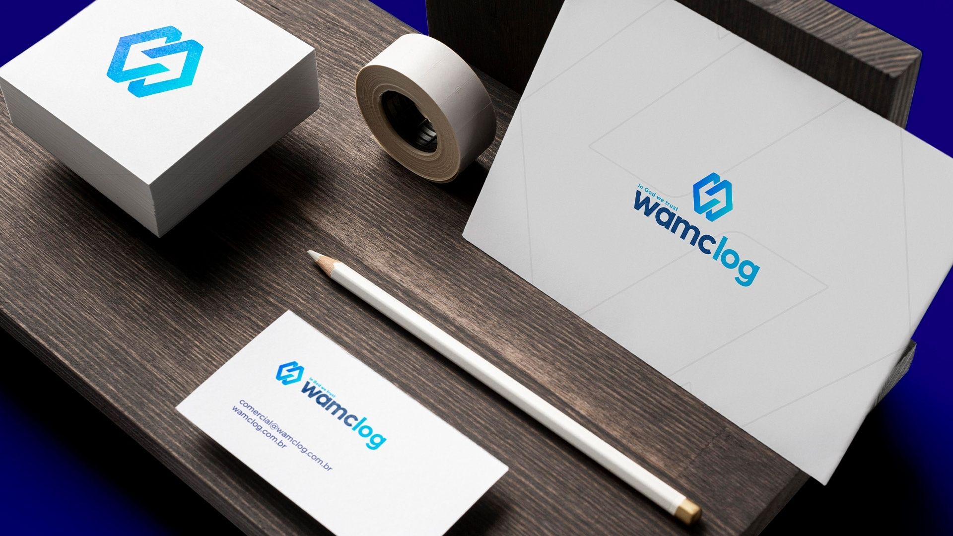
WAMC

WAMC sought a contemporary identity that matched its international expansion.

The new branding combines global positioning, professionalism and technology into a modern and distinctive visual language.

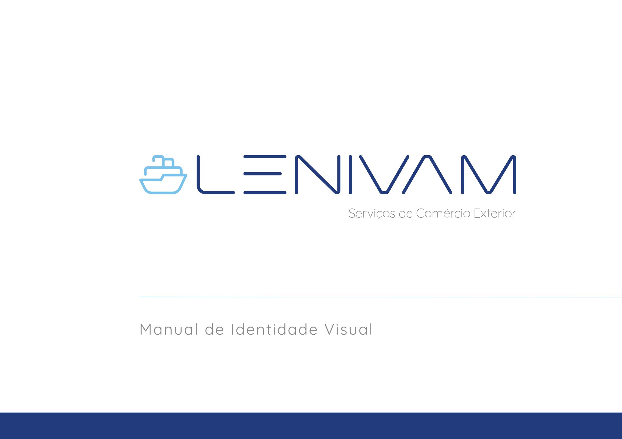
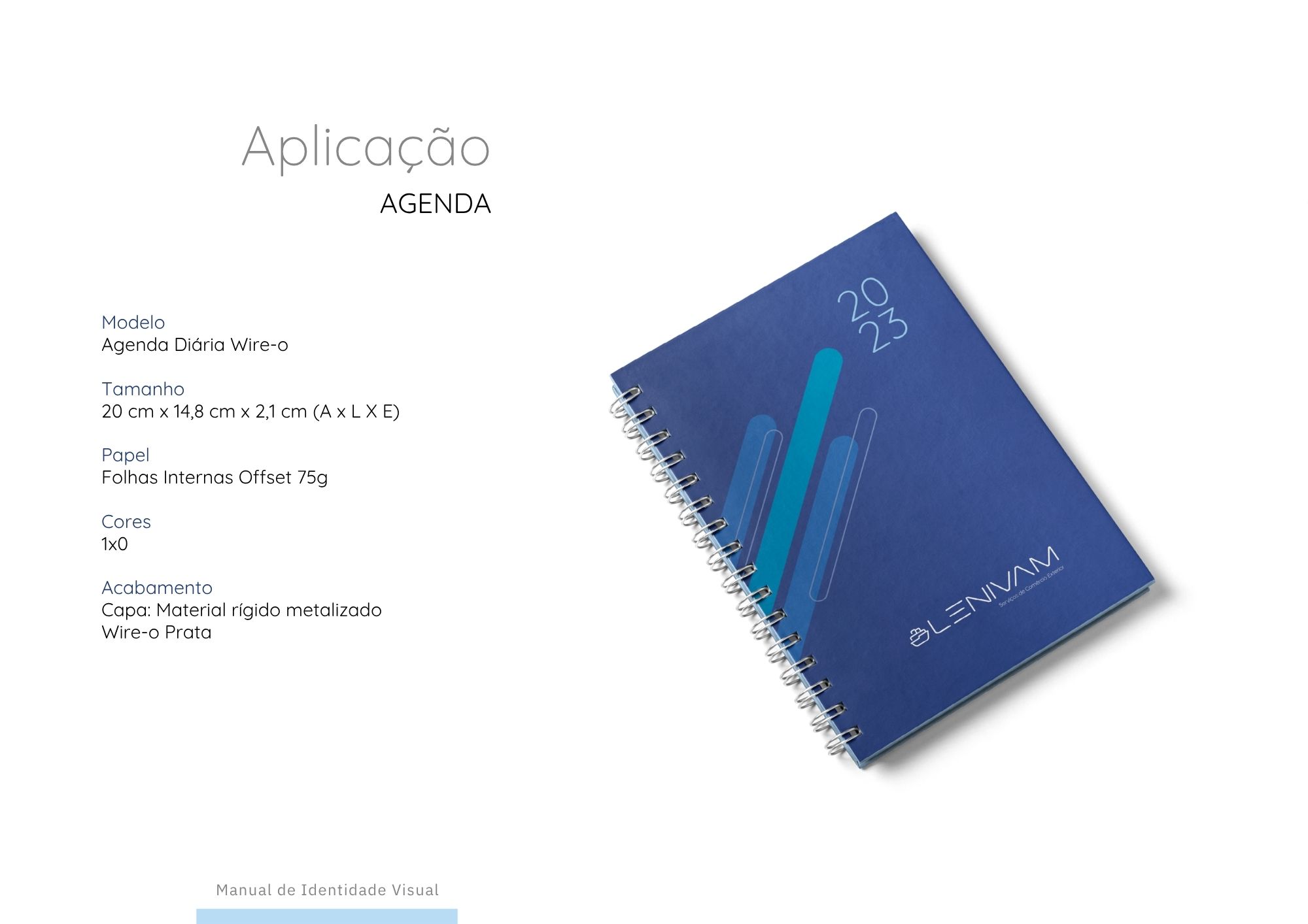
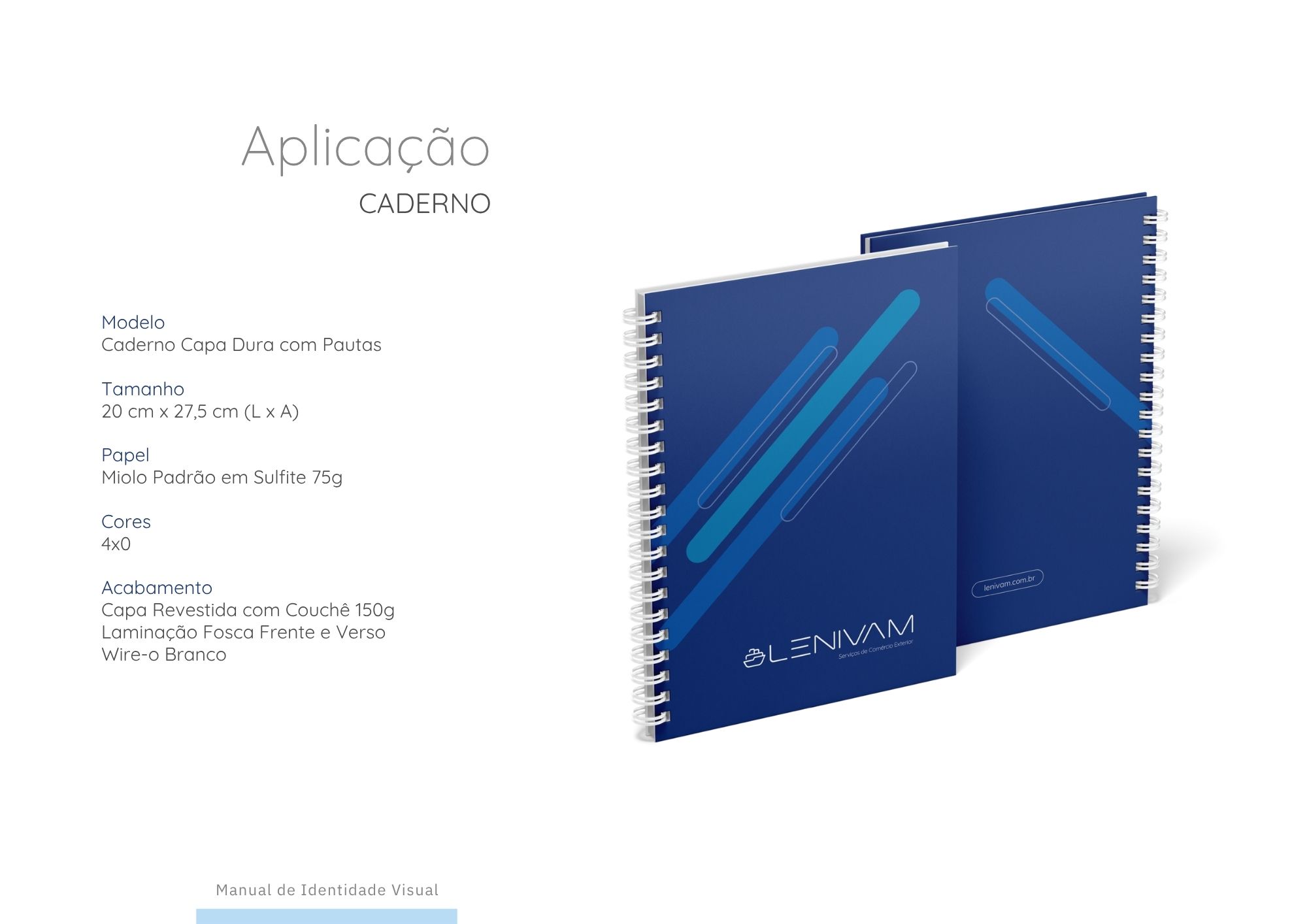
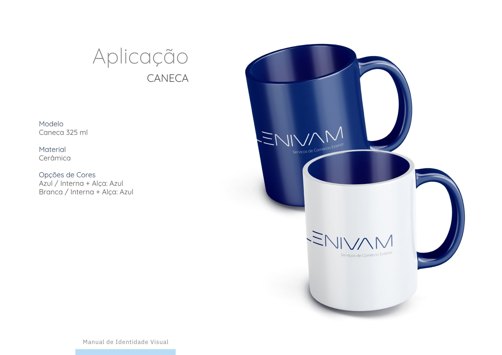
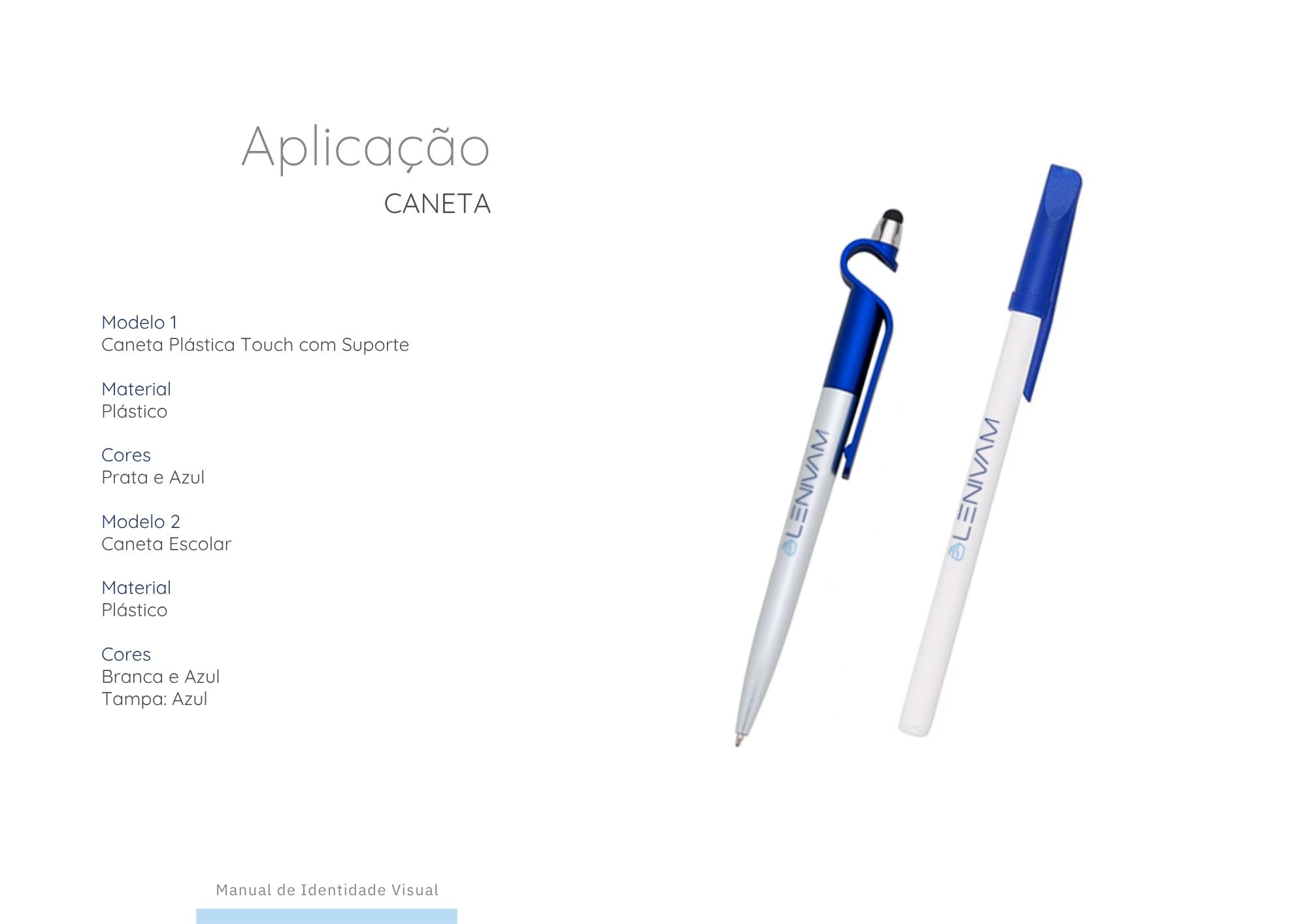
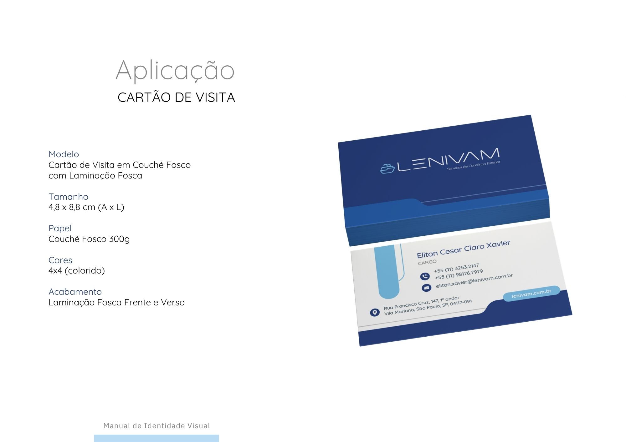
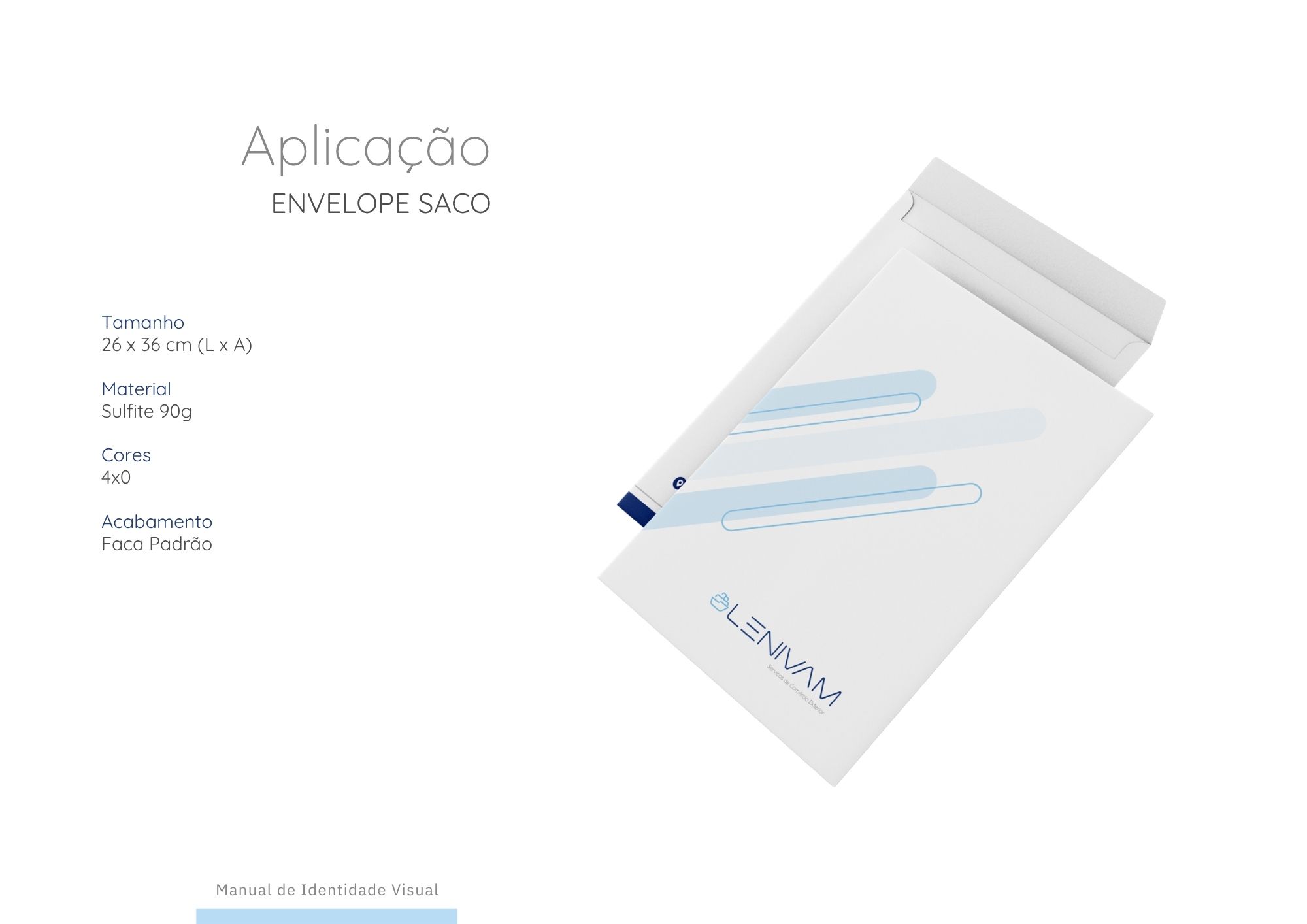
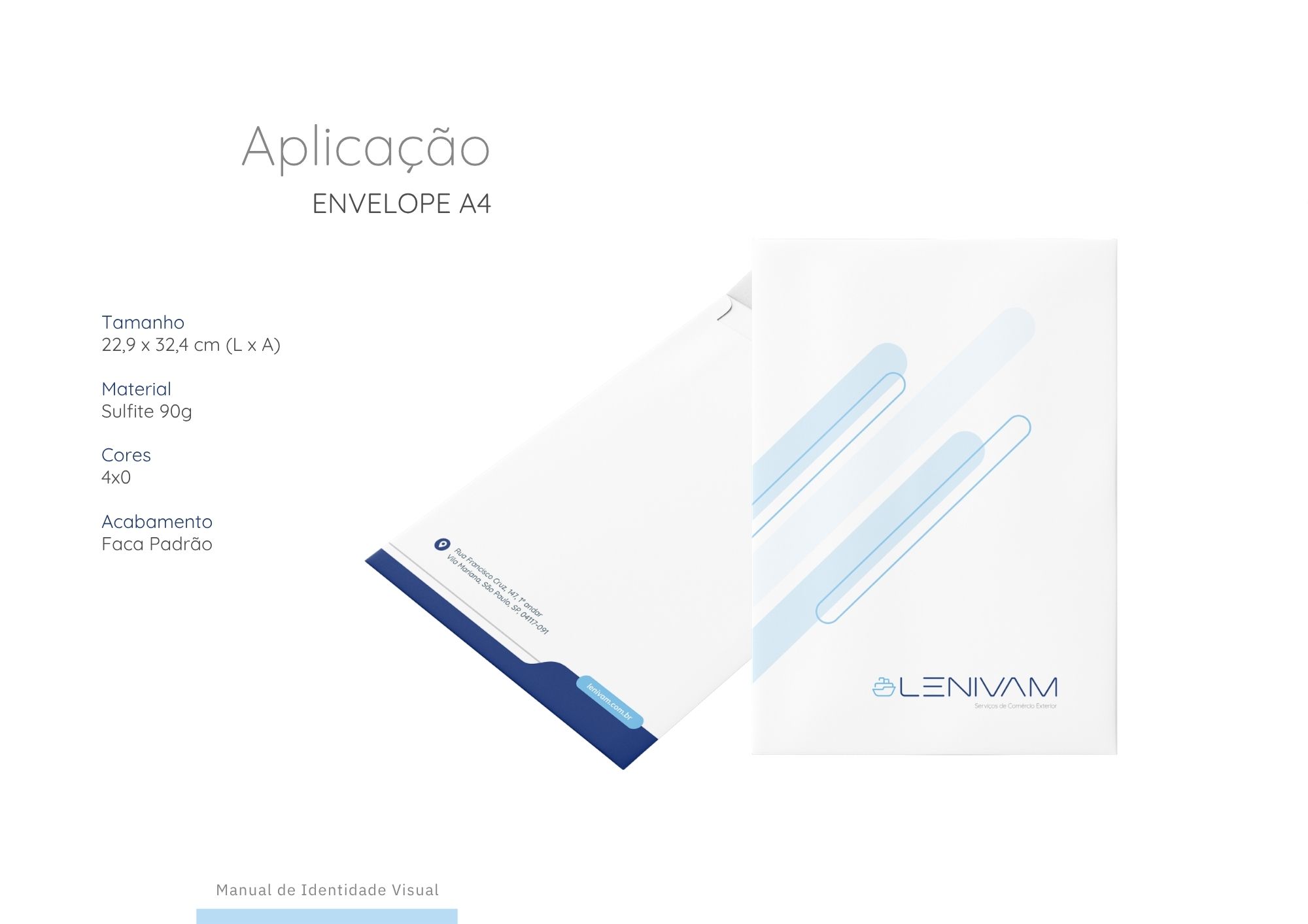
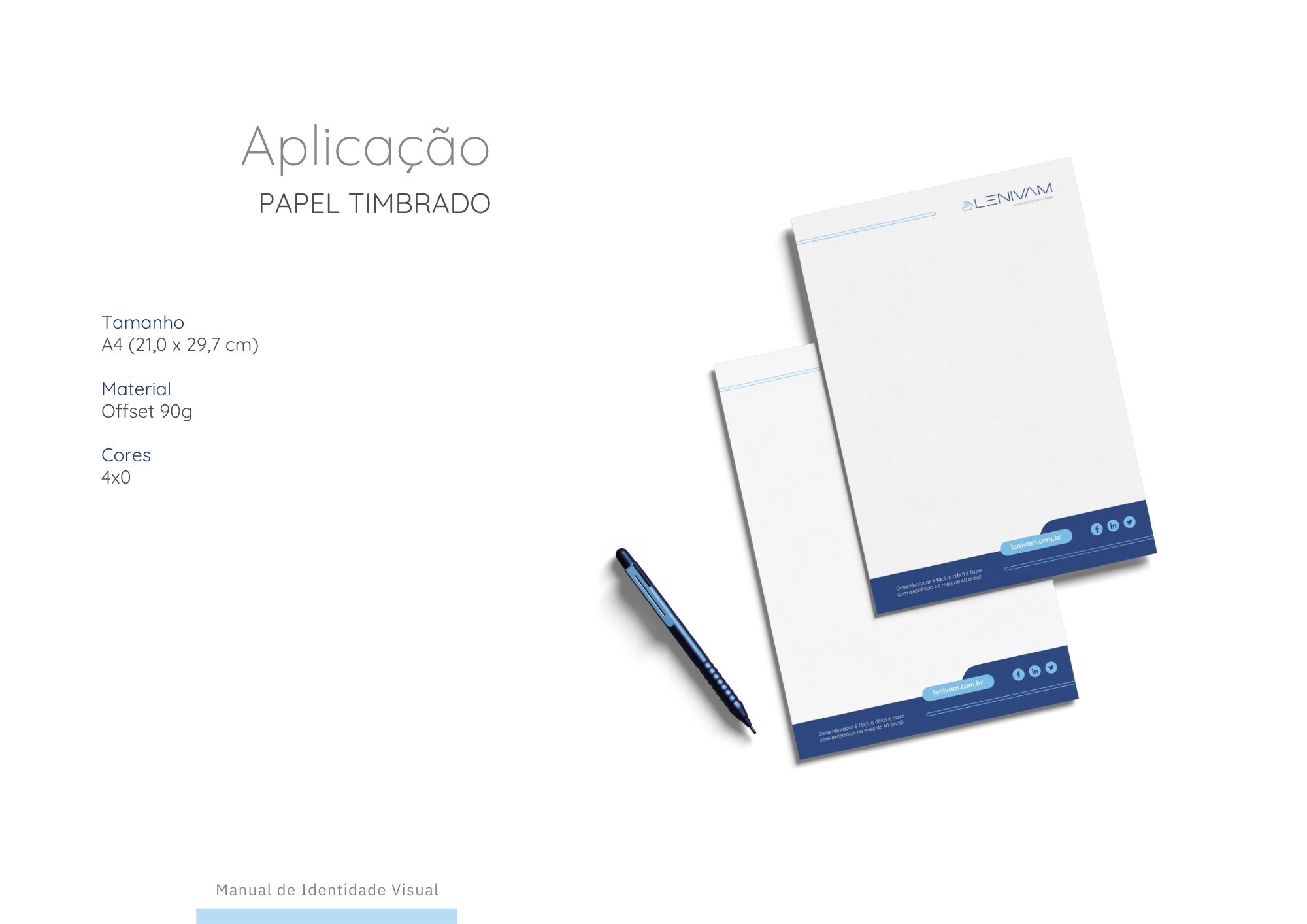
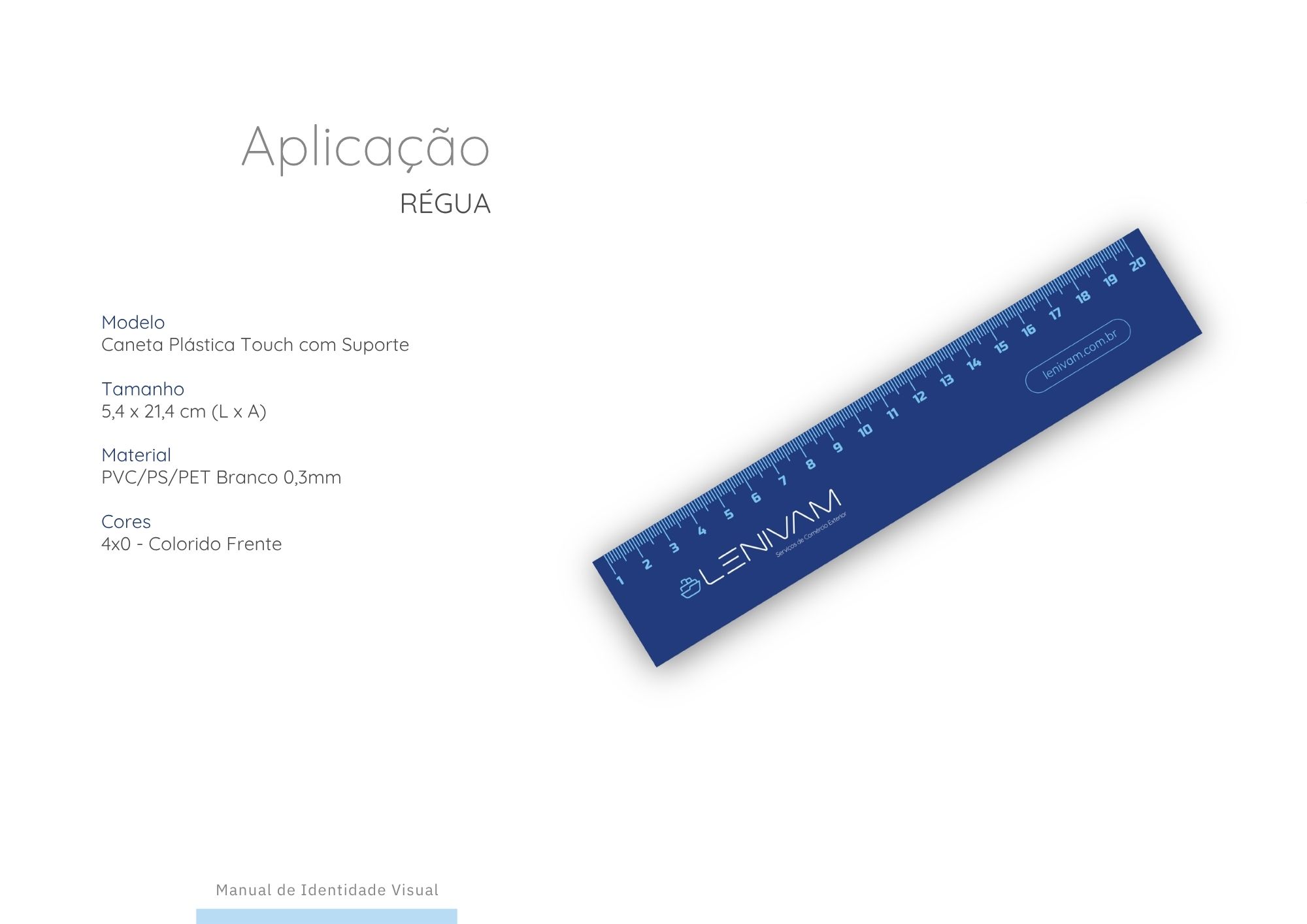
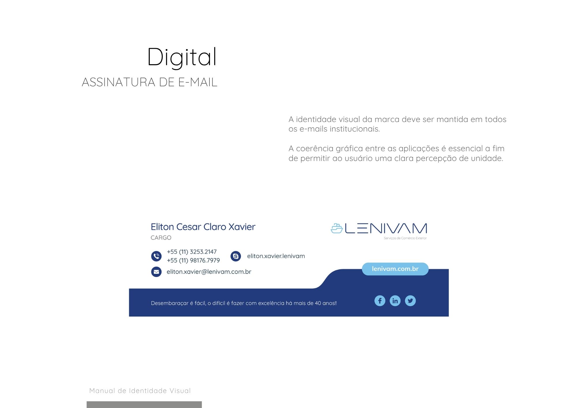
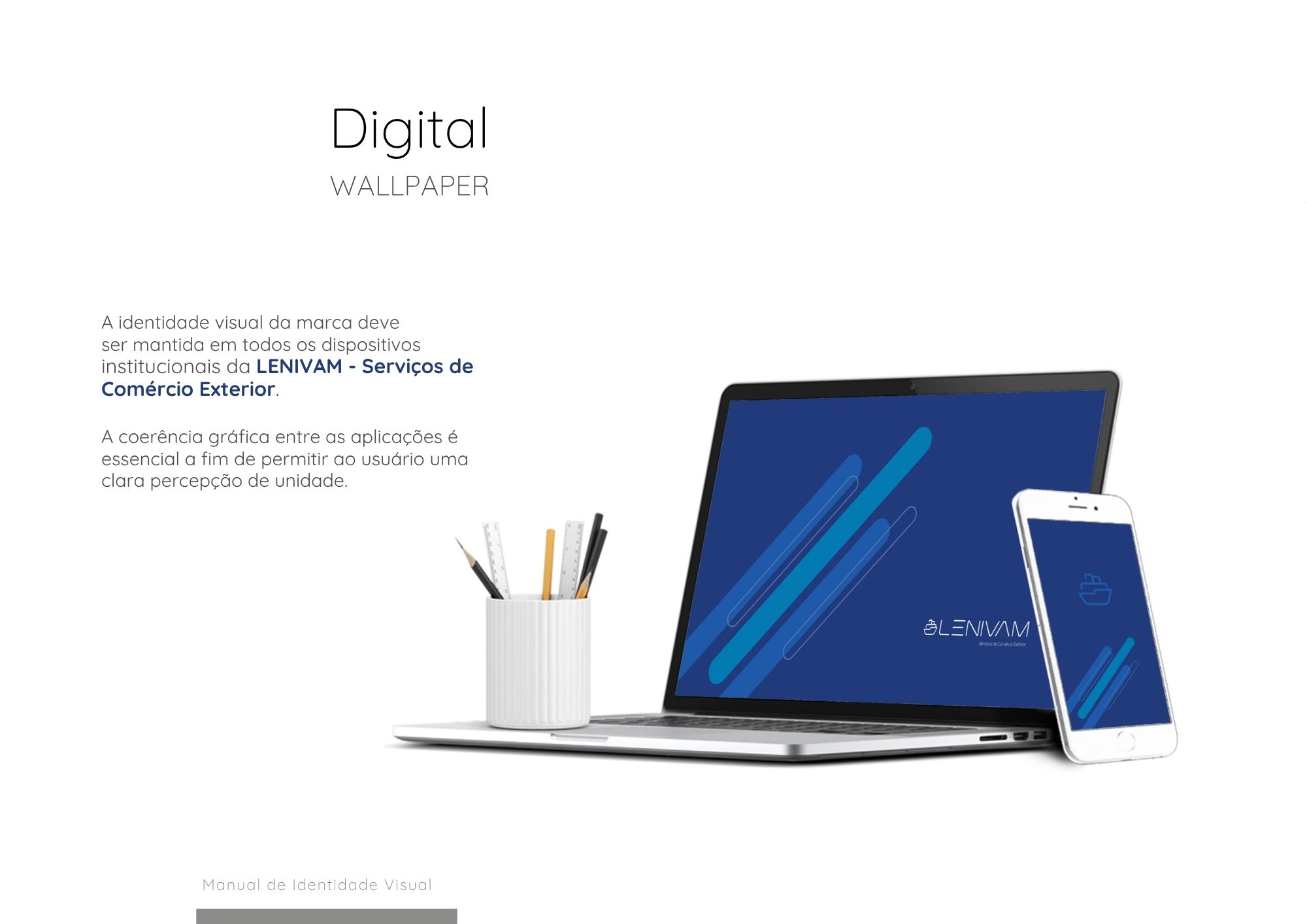
LENIVAN

Lenivan received a refreshed identity aligned with its current market positioning.

The project focused on professionalizing communication while strengthening the company’s digital presence through a cleaner and more consistent visual system.

Our Process

  • 1
    Discovery
  • 2
    Brand Assessment
  • 3
    Brand Strategy & Concept
  • 4
    Design System
  • 5
    Brand Applications
  • 6
    Brand Launch & Onboarding

Ready to Transform Your Brand?

Our team is ready to create a brand that reflects your company’s future in international trade.